Exploring the COVID-19 Pandemic by Country
By Charles Holbert
March 18, 2020
Introduction
As of 16 March 2020, a total of 169,411 cases of coronavirus (COVID-19) were confirmed with 86,228 active cases in 146 countries and territories around the world, including five cruise ships. The outbreak first started in Wuhan, Hubei Province, China, but cases have been identified in a growing number of other locations internationally, including the United States. Different parts of the world are seeing different levels of COVID-19 activity. The United States nationally is currently in the initiation phases, but states where community spread is occurring are in the acceleration phase. The duration and severity of each phase can vary depending on the characteristics of the virus and the public health response. Because data on coronavirus infections are uncertain, the quantification of the outbreak is difficult.
Every country’s numbers are the result of a specific set of testing and accounting regimes. Because there are inconsistencies in the numbers, any trends in the data must be interpreted very cautiously. With that said, let’s review the cases of coronavirus by country. It should be noted that this work has not been peer-reviewed nor do I claim any particular expertise in communicable, or infectious diseases.
Exploratory Data Analysis
Let’s load the data, which includes daily incidence from January 16, 2020 through March 16, 2020. This wikipedia page, which is currently being updated promptly as new data are released, is a detailed and well-referenced source.
# Load libraries
library(dplyr)
library(ggplot2)
library(gridExtra)
library(grid)
library(scales)
library(lubridate)
library(ggrepel)
library(EpiEstim)
library(incidence)
library(RColorBrewer)

# Load modified EpiEstim plotting function
source("functions/plot_EpiEstim.R")

# Load data
dat <- read.csv('data/combined_data.csv', header = T)
dat$date <- as.Date(dat$date, format = '%m/%d/%Y')

str(dat)
## 'data.frame':	280 obs. of  4 variables:
##  $ date      : Date, format: "2020-01-16" "2020-01-17" ...
##  $ cumulative: int  45 62 121 198 291 440 571 830 1287 1975 ...
##  $ daily     : int  45 17 59 77 93 149 131 259 457 688 ...
##  $ location  : chr  "China" "China" "China" "China" ...
head(dat)
##         date cumulative daily location
## 1 2020-01-16         45    45    China
## 2 2020-01-17         62    17    China
## 3 2020-01-18        121    59    China
## 4 2020-01-19        198    77    China
## 5 2020-01-20        291    93    China
## 6 2020-01-21        440   149    China
We see that the data consist of 280 observations and four varaibles. The data include the daily incremental and cumative incidence grouped by location.
Daily cumulative incidence
First, let’s look at the daily cumulative number of cases for the top 10 infected countries.
ggplot(data = dat, aes(x = date, y = cumulative)) +
  geom_point(color = "#76A99D") +
  geom_line(color = "#76A99D") +
  scale_x_date(date_breaks = "7 days",
               date_labels = "%d %b") +
  scale_y_continuous(labels = function(x) format(x, big.mark = ",",
                                                 scientific = FALSE)) +
  facet_grid(location ~., scales = "free_y") +
  labs(title = "Cumulative Cases of COVID-19",
       subtitle = "January 16 through March 17, 2020",
       x = "Date",
       y = "Daily Cumulative Incidence",
       caption = "Note: varying y-axis scales") +
  theme_bw() +
  theme(plot.title = element_text(margin = margin(b = 3), size = 14,
                                  hjust = 0.0, color = "black",
                                  face = quote(bold)),
        plot.subtitle = element_text(margin = margin(b = 3), size = 12,
                                     hjust = 0.0, color = "black",
                                     face = quote(italic)),
        axis.title.y = element_text(size = 12, color = "black"),
        axis.title.x = element_text(size = 12, color = "black"),
        axis.text.x = element_text(size = 10, color = "black"),
        axis.text.y = element_text(size = 10, color = "black"),
        legend.position = "none",
        strip.text.y = element_text(size = 10, color = "black",
                                    face = quote(bold)))
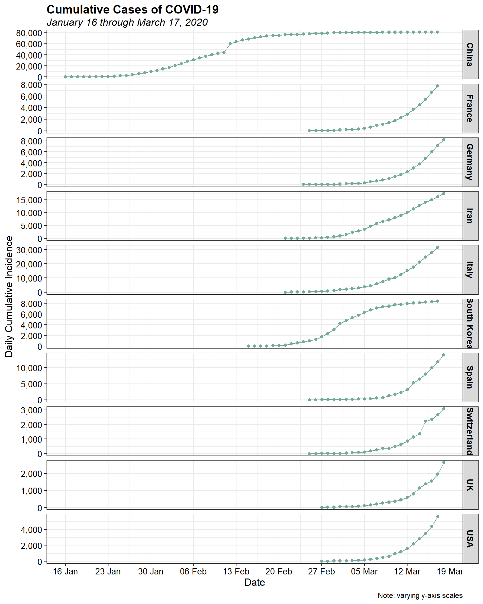
The initial increases for most countries look to be approximately exponential, as is expected for epidemic spread. Let’s plot them using a log-linear plot to see if the epidemic curve is indeed exponential.
ggplot(data = dat, aes(x = date, y = cumulative)) +
  geom_point(color = "#76A99D") +
  geom_line(color = "#76A99D") +
  scale_x_date(date_breaks = "7 days",
               date_labels = "%d %b") +
  scale_y_log10(labels = function(x) format(x, big.mark = ",",
                                            scientific = FALSE)) +
  facet_grid(location ~., scales = "free_y") +
  labs(title = "Cumulative Cases of COVID-19",
       subtitle = "January 16 through March 17, 2020",
       x = "Date",
       y = "Daily Cumulative Incidence",
       caption = "Note: varying y-axis scales") +
  theme_bw() +
  theme(plot.title = element_text(margin = margin(b = 3), size = 14,
                                  hjust = 0.0, color = "black",
                                  face = quote(bold)),
        plot.subtitle = element_text(margin = margin(b = 3), size = 12,
                                     hjust = 0.0, color = "black",
                                     face = quote(italic)),
        axis.title.y = element_text(size = 12, color = "black"),
        axis.title.x = element_text(size = 12, color = "black"),
        axis.text.x = element_text(size = 10, color = "black"),
        axis.text.y = element_text(size = 10, color = "black"),
        legend.position = "none",
        strip.text.y = element_text(size = 10, color = "black",
                                    face = quote(bold)))
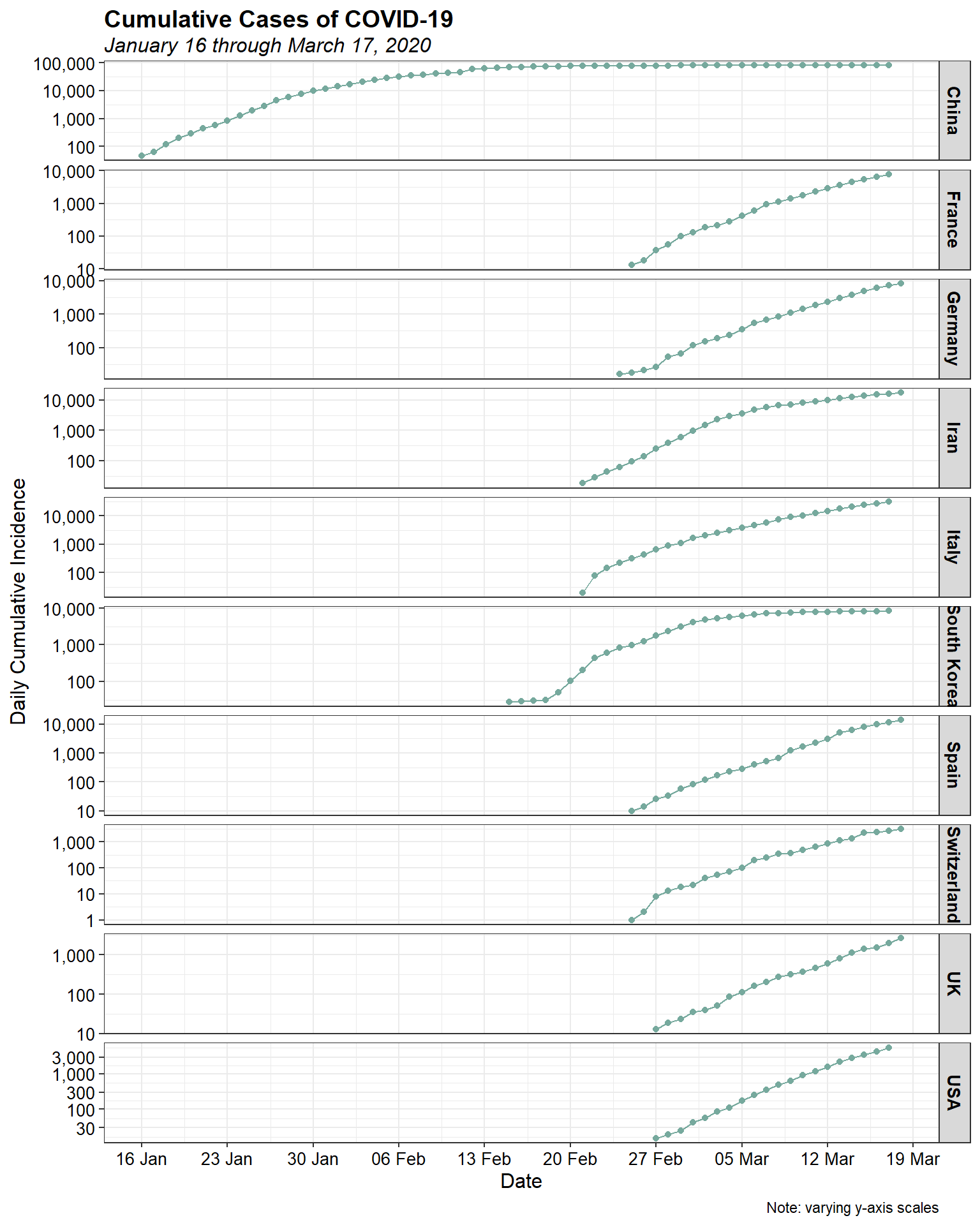
Log-linearity appears to be present in the data for most, if not all, of the countries. Let’s look at the daily cumulative incidence by country using a bar chart.
ggplot(data = dat, aes(x = date, y = cumulative)) +
  geom_bar(stat = "identity", width = 0.9, color = "white",
           fill = "#76A99D") +
  scale_x_date(date_breaks = "7 days",
               date_labels = "%d %b") +
  scale_y_continuous(labels = function(x) format(x, big.mark = ",",
                                                 scientific = FALSE)) +
  facet_grid(location ~., scales = "free_y") +
  labs(title = "Cumulative Cases of COVID-19",
       subtitle = "January 16 through March 17, 2020",
       x = "Date",
       y = "Daily Cumulative  Incidence",
       caption = "Note: varying y-axis scales") +
  theme_bw() +
  theme(plot.title = element_text(margin = margin(b = 3), size = 14,
                                  hjust = 0.0, color = "black",
                                  face = quote(bold)),
        plot.subtitle = element_text(margin = margin(b = 3), size = 12,
                                     hjust = 0.0, color = "black",
                                     face = quote(italic)),
        axis.title.y = element_text(size = 12, color = "black"),
        axis.title.x = element_text(size = 12, color = "black"),
        axis.text.x = element_text(size = 10, color = "black"),
        axis.text.y = element_text(size = 10, color = "black"),
        legend.position = "none",
        strip.text.y = element_text(size = 10, color = "black",
                                    face = quote(bold)))
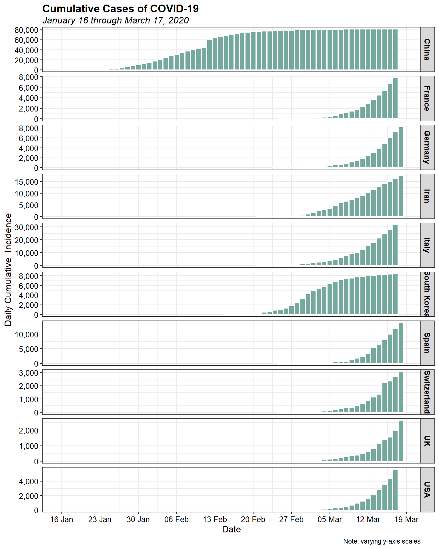
Now, let’s look at the daily cumulative incidence, with all countries on the same scale to put things in perspective.
ggplot(data = dat, aes(x = date, y = cumulative)) +
  geom_bar(stat = "identity", width = 0.9, color = "white",
           fill = "#76A99D") +
  scale_x_date(date_breaks = "7 days",
               date_labels = "%d %b") +
  scale_y_continuous(labels = function(x) format(x, big.mark = ",",
                                                 scientific = FALSE)) +
  facet_grid(location ~.) +
  labs(title = "Cumulative Cases of COVID-19",
       subtitle = "January 16 through March 17, 2020",
       x = "Date",
       y = "Daily Cumulative  Incidence",
       caption = "Note: varying y-axis scales") +
  theme_bw() +
  theme(plot.title = element_text(margin = margin(b = 3), size = 14,
                                  hjust = 0.0, color = "black",
                                  face = quote(bold)),
        plot.subtitle = element_text(margin = margin(b = 3), size = 12,
                                     hjust = 0.0, color = "black",
                                     face = quote(italic)),
        axis.title.y = element_text(size = 12, color = "black"),
        axis.title.x = element_text(size = 12, color = "black"),
        axis.text.x = element_text(size = 10, color = "black"),
        axis.text.y = element_text(size = 10, color = "black"),
        legend.position = "none",
        strip.text.y = element_text(size = 10, color = "black",
                                    face = quote(bold)))
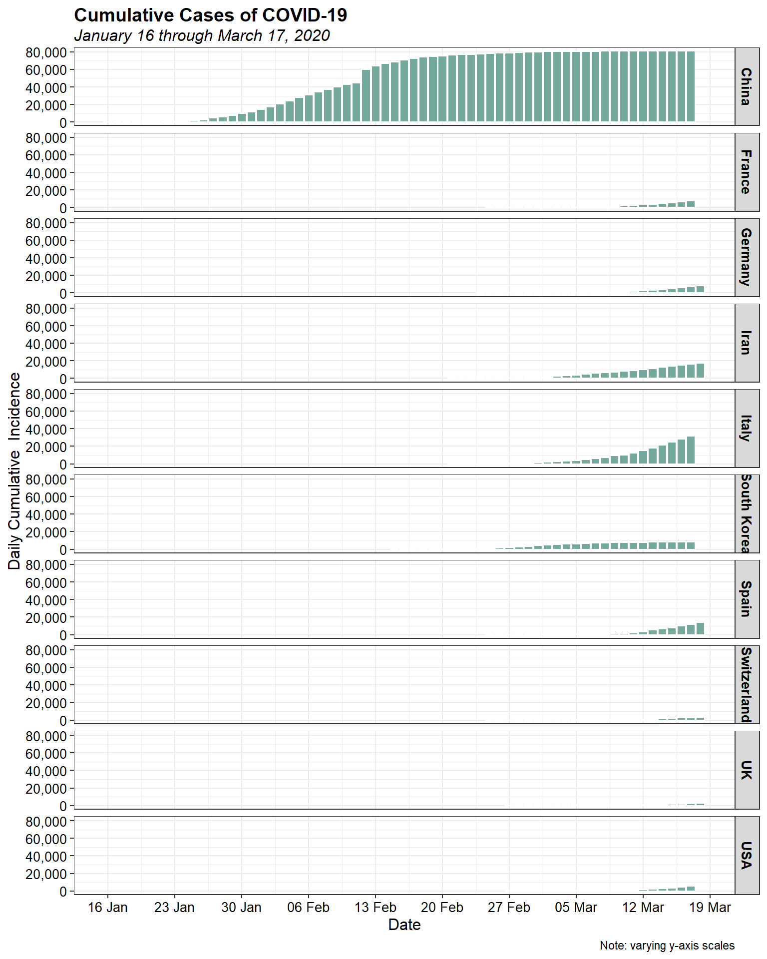
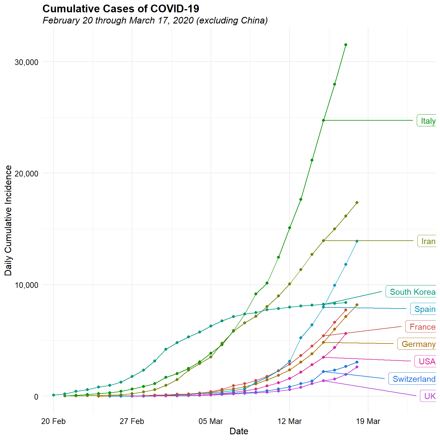
It is clear that China is the epicentre of the outbreak. Let’s look at the daily cumulative incidence, excluding China, on a single plot.
# Daily cumulative incidence on single plot
mindate <- as.Date('2/20/2020', format = '%m/%d/%Y')
d <- subset(dat, location != "China" & date >= mindate)
ggplot(data = d, aes(x = date, y = cumulative, group = location,
       color = location)) +
  geom_point() +
  geom_line() +
  geom_label_repel(aes(label = location),
                    data = d[d$date == '2020-03-15', ], nudge_x = 10, hjust = 1) +
  scale_x_date(date_breaks = "7 days",
               date_labels = "%d %b",
               expand = expansion(add = c(1, 7))) +
  scale_y_continuous(labels = function(x) format(x, big.mark = ",",
                                                 scientific = FALSE)) +
  scale_color_hue(l = 50, guide = 'none') +
  labs(title = "Cumulative Cases of COVID-19",
       subtitle = "February 20 through March 17, 2020 (excluding China)",
       x = "Date",
       y = "Daily Cumulative Incidence") +
  theme_minimal() +
  theme(plot.title = element_text(margin = margin(b = 3), size = 14,
                                  hjust = 0.0, color = "black",
                                  face = quote(bold)),
        plot.subtitle = element_text(margin = margin(b = 3), size = 12,
                                     hjust = 0.0, color = "black",
                                     face = quote(italic)),
        axis.title.y = element_text(size = 12, color = "black"),
        axis.title.x = element_text(size = 12, color = "black"),
        axis.text.x = element_text(size = 10, color = "black"),
        axis.text.y = element_text(size = 10, color = "black"),
        legend.position = "none")
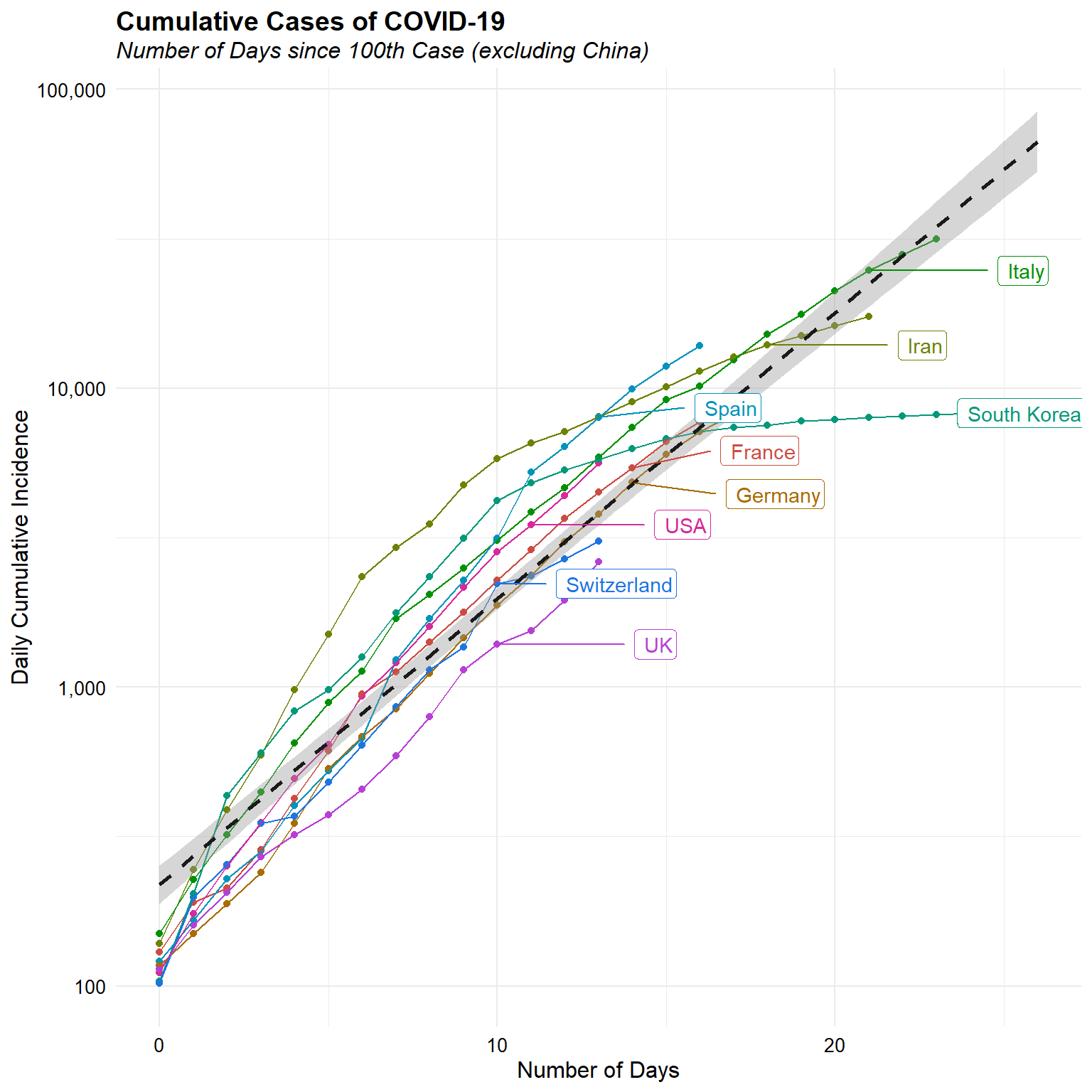
Now, let’s look at the daily cumulative incidence since the 100th case for each counrty, agin excluding China.
d <- dat %>%
  filter(cumulative > 100 & location != "China") %>%
  group_by(location) %>%
  mutate(days_since_100 = as.numeric(date - min(date))) %>%
  ungroup

ggplot(data = d, aes(x = days_since_100, y = cumulative,
       group = location, color = location)) +
  geom_point() +
  geom_line() +
  geom_smooth(method = 'lm', aes(group = 1),
             color = 'grey10', linetype = 'dashed') +
  geom_label_repel(aes(label = location),
                    data = d[d$date == '2020-03-15', ], nudge_x = 5, hjust = 1) +
  scale_y_log10(labels = function(x) format(x, big.mark = ",",
                                            scientific = FALSE)) +
  scale_color_hue(l = 50, guide = 'none') +
  labs(title = "Cumulative Cases of COVID-19",
       subtitle = "Number of Days since 100th Case (excluding China)",
       x = "Number of Days",
       y = "Daily Cumulative Incidence") +
  theme_minimal() +
  theme(plot.title = element_text(margin = margin(b = 3), size = 14,
                                  hjust = 0.0, color = "black",
                                  face = quote(bold)),
        plot.subtitle = element_text(margin = margin(b = 3), size = 12,
                                     hjust = 0.0, color = "black",
                                     face = quote(italic)),
        axis.title.y = element_text(size = 12, color = "black"),
        axis.title.x = element_text(size = 12, color = "black"),
        axis.text.x = element_text(size = 10, color = "black"),
        axis.text.y = element_text(size = 10, color = "black"),
        legend.position = "none")
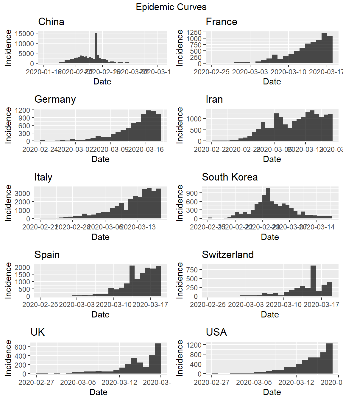
Daily incremental incidence
Let’s also look at the daily incremental incidence. This is more informative, and is referred to as the epidemic curve. It is traditionally visualised as a bar chart, which emphasises missing data more than a time series or line chart.
ggplot(data = dat, aes(x = date, y = daily)) +
  geom_bar(stat = "identity", width = 0.9, color = "white",
           fill = "#76A99D") +
  scale_x_date(date_breaks = "7 days",
               date_labels = "%d %b") +
  scale_y_continuous(labels = function(x) format(x, big.mark = ",",
                                                 scientific = FALSE)) +
  facet_grid(location ~., scales = "free_y") +
  labs(title = "Incremental Cases of COVID-19",
       subtitle = "January 16 through March 17, 2020",
       x = "Date",
       y = "Daily Incremental Incidence",
       caption = "Note: varying y-axis scales") +
  theme_bw() +
  theme(plot.title = element_text(margin = margin(b = 3), size = 14,
                                  hjust = 0.0, color = "black",
                                  face = quote(bold)),
        plot.subtitle = element_text(margin = margin(b = 3), size = 12,
                                     hjust = 0.0, color = "black",
                                     face = quote(italic)),
        axis.title.y = element_text(size = 12, color = "black"),
        axis.title.x = element_text(size = 12, color = "black"),
        axis.text.x = element_text(size = 10, color = "black"),
        axis.text.y = element_text(size = 10, color = "black"),
        legend.position = "none",
        strip.text.y = element_text(size = 10, color = "black",
                                    face = quote(bold)))
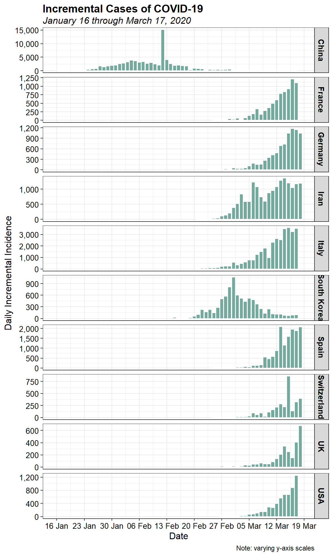
While it appears that the spreda of the virus as stabiliized in China, a rapid increase in the number of cases within the past few days can be seen in several other countries. It should be noted that a spike in cases reported in China on February 13, 2020 was due to a change in the diagnosis methodology which led to thousands of new cases being added to the total count.
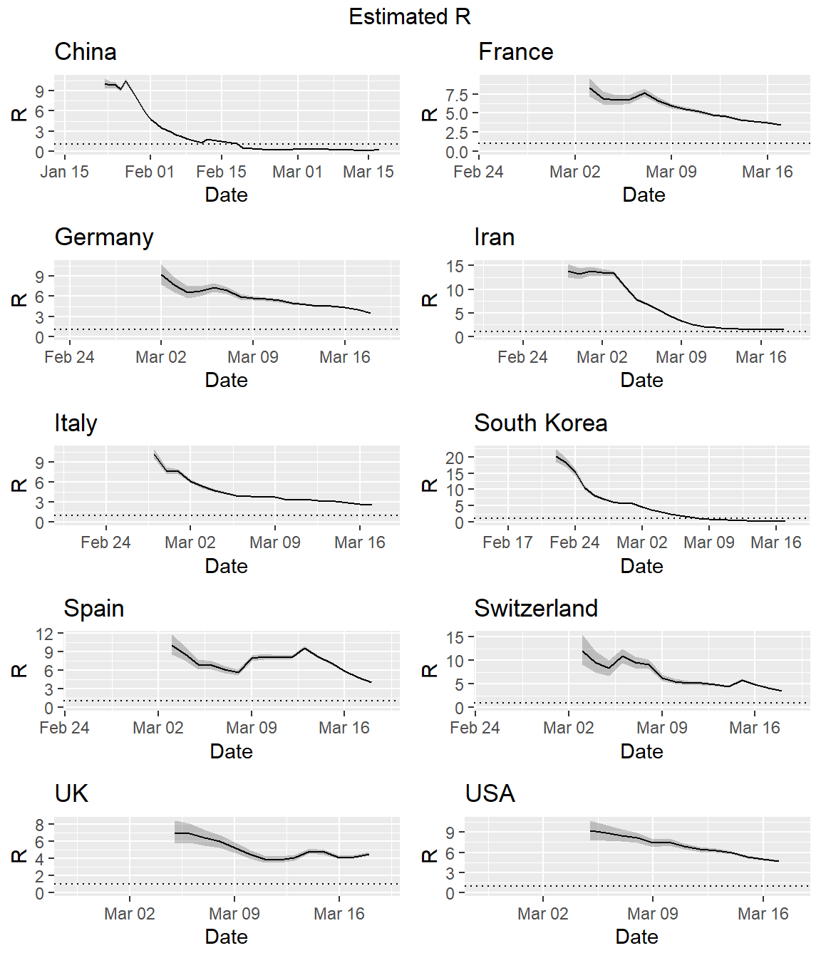
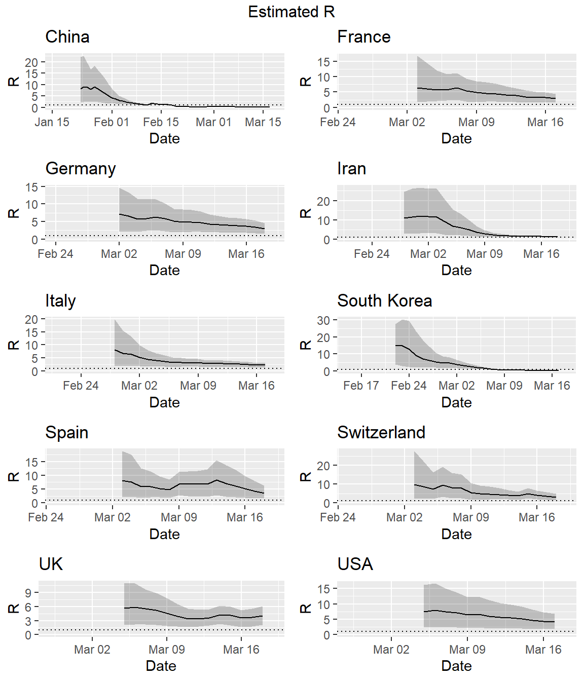
Effective Reproduction Numbers
It is useful to estimate the effective reproduction number \(R_e\) on a day-by-day basis so as to track the effectiveness of public health interventions. There are several available methods for estimating \(R_e\). The EpiEstim package for R can be used to estimate the instantaneous \(R_e\).
A critical parameter for estimating the instantaneous \(R_e\) is the serial interval (SI). The SI is the time between onset of symptoms of each case of the disease in question, and the onset of symptoms in any secondary cases that result from transmission from the primary cases. The SI is a statistical distribution of serial interval times, rather than a fixed value. That distribution can be simulated, typically using a discrete gamma distribution with a given mean and standard deviation.
Li et al. estimate the SI distribution to have a mean of 7.5 days with a standard deviation (SD) of 3.4 days. These values were derived from analysis of 5 primary cases among the first 450 cases in Wuhan, China. These values are similar to the SI parameters for the Middle East respiratory syndrome coronavirus (MERS-CoV), which has a mean of 7.6 and a SD of 3.4 (Zhao et al. 2020). This similarity is not surprising given that both pathogens are coronavirii. Let’s use these values to estimate the instantaneous \(R_e\) for the different countries.
First, we will need to create a custom code to generate the instantaneous \(R_e\) for all countries. A modification of the plotting function used in the EpiEstim R package is required to use the country name as the plot title. Once the function is created, we will then loop over the complete data set, creating a plot of the instantaneous \(R_e\) for each country.
# Function to get estimate_R from EpiEstim package
get_res <- function(locid, datdf, type = "R") {
  res <- estimate_R(datdf,
                    method = "parametric_si",
                    config = make_config(list(mean_si = 7.5,
                                         std_si = 3.4)))
  if (type == "R") {
    p <- plot_EpiEstim(res, what = "R", legend = FALSE,
                       options_R = list(xlab = "Date",
                                        main = locid))
  }
  if (type == "SI") {
    p <- plot_EpiEstim(res, what = "SI", legend = FALSE,
                       options_SI = list(xlab = "Date",
                                        main = locid))
  }
  if (type == "incid") {
    p <- plot_EpiEstim(res, what = "incid", legend = FALSE,
                       options_I = list(xlab = "Date",
                                        main = locid))
  }

  return(p)
}

# Loop to estimate changes in the effective reproduction
locs <- sort(unique(dat$location))
plots <- list()
i <- 1

for (loc in locs) {
  dats <- dat[with(dat, location == loc),] %>%
    droplevels()
  colnames(dats) <- c("dates", "cumulative", "I", "location")
  plots[[i]] <- get_res(loc, dats[, c("dates", "I")], "R")
  i <- i + 1
}

do.call("grid.arrange", c(plots, ncol = 2, top = "Estimated R"))
Uncertainty in the SI distribution can be evaluated by specifying a distribution of distributions of SIs in the EpiEstim package. Let’s rerun the estimates using the mean SI estimated by Li et al. of 7.5 days, with an SD of 3.4, but allowing that mean SI to vary between 2.3 and 8.4 using a truncated normal distribution with an SD of 2.0. Let’s also allow the SD to vary between 0.5 and 4.0. Similar to the estimation of the instantaneous \(R_e\) above, we first need to create a custom code to run the simulations for all countries in our data set.
# Function to get estimate_R simulations from EpiEstim package
get_res_sim <- function(locid, datdf, type = "R") {
  res <- estimate_R(datdf,
                    method = "uncertain_si",
                    config = make_config(list(mean_si = 7.5,
                                              std_mean_si = 2.0,
                                              min_mean_si = 2.3,
                                              max_mean_si = 8.4,
                                              std_si = 3.4,
                                              std_std_si = 1,
                                              min_std_si = 0.5,
                                              max_std_si = 4,
                                              n1 = 1000,
                                              n2 = 1000)))
  if (type == "R") {
    p <- plot_EpiEstim(res, what = "R", legend = FALSE,
                       options_R = list(xlab = "Date",
                                        main = locid))
  }
  if (type == "SI") {
    p <- plot_EpiEstim(res, what = "SI", legend = FALSE,
                       options_SI = list(xlab = "Date",
                                        main = locid))
  }
  if (type == "incid") {
    p <- plot_EpiEstim(res, what = "incid", legend = FALSE,
                       options_I = list(xlab = "Date",
                                        main = locid))
  }
  return(p)
}

# Loop to estimate changes in the effective reproduction
locs <- sort(unique(dat$location))
plots <- list()
i <- 1

for (loc in locs) {
  dats <- dat[with(dat, location == loc),] %>%
    droplevels()
  colnames(dats) <- c("dates", "cumulative", "I", "location")
  plots[[i]] <- get_res_sim(loc, dats[, c("dates", "I")], "R")
  i <- i + 1
}

do.call("grid.arrange", c(plots, ncol = 2, top = "Estimated R"))
We also can use our custom functions and the EpiEstim package for R to generate the epidemic curve for each country.
# Loop to estimate the epidemic curve
locs <- sort(unique(dat$location))
plots <- list()
i <- 1

for (loc in locs) {
  dats <- dat[with(dat, location == loc),] %>%
    droplevels()
  colnames(dats) <- c("dates", "cumulative", "I", "location")
  plots[[i]] <- get_res(loc, dats[, c("dates", "I")], "incid")
  i <- i + 1
}

do.call("grid.arrange", c(plots, ncol = 2, top = "Epidemic Curves"))
Patterns
Visual differentiation of the data based on the many epidemic curves is rather difficult. Let’s see if we can classify the daily incremental incidence data into clusters. One approach is to use principal component analysis (PCA) to create a simple two-dimensional (2-D) mapping to visualize the pairwise Euclidean distance between groups of data. PCA is a useful statistical tool for analyzing multivariate data. PCA uses spectral (eigenvalue) decomposition to transform a number of correlated variables into a smaller number of uncorrelated variables, called principal components (PCs), with a minimum loss of information. These new variables are linear combinations of the original variables. In a nutshell, nearby circles (i.e., countries) in 2-D ordination should have similar growth patterns, and circles that are far apart from each other should have few patterns in common.
PCA requires that the input variables have similar scales of measurement and when comparing variables that have different units of measure and different variances, the data need to be standardized. Let’s standardize the data by mean-centering and scaling to unit variance prior to conducting PCA. Then, let’s plot the PCA results color-coded by the total number of reported cases for each country, transformed using a log base-10 transformation.
# Get total cases for each country
cdat <- dat %>%
  group_by(location) %>%
  summarize(total = cumulative[which.max(date)])

# Use dcast from reshape to change from long to wide format
dat$location <- as.character(dat$location)
datw <- reshape2::dcast(dat, location ~ date, value.var = 'daily')
rownames(datw) <- datw[, 1]
n <- length(datw)

# Compute the pairwise Euclidean distance matrix on the scaled data
distance_matrix <- as.matrix(dist(scale(datw[, 2:n])))

# Perform PCA on the pairwise distances
pca <- prcomp(distance_matrix)
dat.pca <- cbind.data.frame(location = datw[,1], pca$x[, 1:2]) %>%
    left_join(cdat, by = "location")

# Plot the results
ggplot(dat.pca, aes(x = PC1, y = PC2)) +
  geom_point(aes(color = log10(total)), size = 14, alpha = 0.7) +
  geom_text(aes(label = location), check_overlap = TRUE) +
  scale_color_gradientn(colors = brewer.pal(7, "YlGn"),
                        guide = "none") +
  labs(title = "PCA of Daily Incremental Cases of COVID-19",
       subtitle = "January 16 through March 17, 2020") +
  theme_minimal() +
  theme(plot.title = element_text(margin = margin(b = 3), size = 14,
                                  hjust = 0.0, color = "black",
                                  face = quote(bold)),
        plot.subtitle = element_text(margin = margin(b = 3), size = 12,
                                     hjust = 0.0, color = "black",
                                     face = quote(italic)),
        axis.title.y = element_text(size = 12, color = "black"),
        axis.title.x = element_text(size = 12, color = "black"),
        axis.text.x = element_text(size = 10, color = "black"),
        axis.text.y = element_text(size = 10, color = "black"))
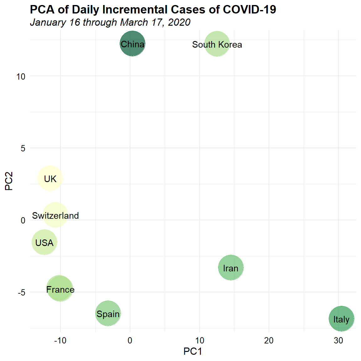
This two-dimensional visualization is easier to view and suggests the presence of some possible patterns in the data. There appear to be 3 main groups of data. Mainland China and South Korea form a cluster in the upper portion of the plot. The UK, USA, Switzerland, France, Germany, and Spain form another cluster on the left of the plot. Iran and Italy form the last cluster on the lower right of the plot. With these classifications, we can now gain more information from the epidemic curve matrix, such as which countries have similar growth patterns and which stage they are in.
Let’s see how the patterns change if we analyze reported cases within the last 20 days. Again, we will plot the results color-coded by the total number of reported cases for each country, transformed using a log base-10 transformation.
# Subset the data to get last 19 days of reported cases
mindate <- as.Date('2/27/2020', format = '%m/%d/%Y')
dat <- dat[with(dat, date >= mindate),] %>%
    droplevels()

# Use dcast from reshape to change from long to wide format
datw <- reshape2::dcast(dat, location ~ date, value.var = 'daily')
rownames(datw) <- datw[, 1]
n <- length(datw)

# Compute the pairwise Euclidean distance matrix on the scaled data
distance_matrix <- as.matrix(dist(scale(datw[, 2:n])))

# Perform PCA on the pairwise distances
pca <- prcomp(distance_matrix)
dat.pca <- cbind.data.frame(location = datw[,1], pca$x[, 1:2]) %>%
    left_join(cdat, by = "location")

# Plot the results
ggplot(dat.pca, aes(x = PC1, y = PC2)) +
  geom_point(aes(color = log10(total)), size = 14, alpha = 0.7) +
  geom_text(aes(label = location), check_overlap = TRUE) +
  scale_color_gradientn(colors = brewer.pal(7, "YlGn"),
                        guide = "none") +
  labs(title = "PCA of Daily Incremental Cases of COVID-19",
       subtitle = "February 27 through March 17, 2020") +
  theme_minimal() +
  theme(plot.title = element_text(margin = margin(b = 3), size = 14,
                                  hjust = 0.0, color = "black",
                                  face = quote(bold)),
        plot.subtitle = element_text(margin = margin(b = 3), size = 12,
                                     hjust = 0.0, color = "black",
                                     face = quote(italic)),
        axis.title.y = element_text(size = 12, color = "black"),
        axis.title.x = element_text(size = 12, color = "black"),
        axis.text.x = element_text(size = 10, color = "black"),
        axis.text.y = element_text(size = 10, color = "black"))
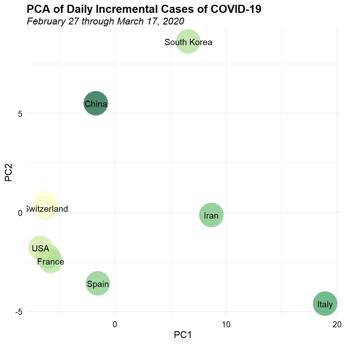
We see separation in China and Korea, and in Iran and Italy. The UK, USA, Switzerland, France, Germany, and Spain form a tighter cluster based on the most recent data.
Conclusions
With the rapid spread in the novel coronavirus across countries, the World Health Organisation (WHO) and several countries have published latest results on the impact of COVID-19 over the past few months. The objective of this exercise is to demonstrate how visualization helps to derive informative insights from data sources. This exercise also illustrates the capabilities of the R statistical programming language for data exploration and visualization.
References
Li, Q. et al. 2020. Early Transmission Dynamics in Wuhan, China, of Novel Coronavirus-Infected Pneumonia. New England Journal of Medicine. DOI: 10.1056/NEJMoa2001316.
Zhao, S., Q. Lin, J. Ran, S.S. Musa, G. Yang, W. Wang, Y. Lou, D. Gao, L. Yang, D. He, and M. Wang. 2020. Preliminary estimation of the basic reproduction number of novel coronavirus (2019-nCoV) in China, from 2019 to 2020: A data-driven analysis in the early phase of the outbreak. International Journal of Infectious Diseases 92, 214-217.
- Posted on:
- March 18, 2020
- Length:
- 17 minute read, 3597 words
- See Also: