Summarize Influent Flow Data Containing No Measurement Date
By Charles Holbert
April 7, 2022
This post summarizes influent flow data for 10 wastewater treatment facilities. The data contain the day of the week that measurements were collected but does not include the date or time of the measurements.
Load libraries and functions
Load libraries and any functions that may be required to analyze the data.
# Load libraries
library(dplyr)
library(tidyr)
library(ggplot2)
library(scales)

source('functions/halfViolinPlots.R')
Set parameters
Create a vector of days so that output can be ordered by day of the week, starting on Monday. Create a vector of colors for plotting the data.
# Create list of days for ordered factor
days <- c('Mon', 'Tue', 'Wed', 'Thu', 'Fri', 'Sat', 'Sun')

# Create vector for colors
cols <- c(
  '#2A4586', 'steelblue', 'cyan1', 'olivedrab4', 'palegreen3',
  'yellow3', 'tan1', 'plum', 'purple3', 'red4'
)
Read and prep data
Read the data from the csv file and then assign the following column names: Station, Day, and Flow. Make the Day and Station variables ordered factors.
# Read data in comma-delimited file
datin <- read.csv('data/influent_flow.csv', header = F)

# Prep data
dat <- datin %>%
  rename(
    Station = V1,
    Day = V2,
    Flow = V3
  )

# Make day or ordered factor
dat$Day<- factor(dat$Day, days, ordered = TRUE)

# Make station an ordered factor
dat$Station <- factor(dat$Station, ordered = TRUE)
Check the data for duplicate entries
Check the data for duplicate entries and remove, if present.
# Check for duplicate results
xx <- dat[duplicated(dat[c('Station', 'Day')]),]
if (length(xx$LOCID) > 0) {
    print('Duplicates found in the input data.')
    print('The maximum result will be used for each duplicate.')
    dat <- plyr::ddply(dat, ~Station+Day, function(x){x[which.max(x$Flow),]})
}
Calculate summary statistics for daily flow at each station
The minimum and maximum total daily flows are similar across all stations, but there is a difference in the central tendencies and spread of the data. The coefficient of variation (CV) values are low, indicating minimal dispersion of data points around the mean value.
# Calcuate summary statistics for each station
stats <- dat %>%
  group_by(Station) %>%
  summarize(
    NObs = length(Flow),
    Total = sum(Flow),
    Min = min(Flow),
    Max = max(Flow),
    Mean = mean(Flow),
    Median = median(Flow),
    SD = sd(Flow),
    CV = SD/Mean
  ) %>%
  ungroup()
stats
## # A tibble: 10 x 9
##    Station  NObs  Total   Min   Max  Mean Median    SD    CV
##    <ord>   <int>  <dbl> <dbl> <dbl> <dbl>  <dbl> <dbl> <dbl>
##  1 1000       95 37493.  280.  497.  395.   406.  64.8 0.164
##  2 1001       95 37033.  279.  500   390.   391   64.8 0.166
##  3 1002      102 40630.  281.  496.  398.   409.  61.9 0.155
##  4 1003       77 30020   281.  498.  390.   389.  64.9 0.166
##  5 1004      107 40710.  279.  494.  380.   366.  60.7 0.159
##  6 1005      102 38570.  278.  499.  378.   372.  65.2 0.172
##  7 1006      121 45840.  283.  498.  379.   372   60.6 0.160
##  8 1007      108 42494.  278.  498.  393.   402.  60.9 0.155
##  9 1008       95 37215.  279.  496.  392.   391   65.1 0.166
## 10 1009       98 37324   279.  499.  381.   382.  64.0 0.168
Calculate total flow for each day and station
Flow on Monday is generally less than flow recorded for the remaining days of the week.
# Get totals
totals <- dat %>%
  group_by(Station, Day) %>%
  summarize(Tot.Flow = sum(Flow)) %>%
  ungroup() %>%
  arrange(Station, Day)

# Add margin totals and spread
totals %>% bind_rows(group_by(. ,Day) %>%
              summarise(Tot.Flow = sum(Tot.Flow)) %>%
              mutate(Station = 'Total')) %>%
   bind_rows(group_by(. ,Station) %>%
              summarise(Tot.Flow = sum(Tot.Flow)) %>%
              mutate(Day = 'Total')) %>%
  spread(Day, Tot.Flow) %>%
  select(Station, Mon, Tue, Wed, Thu, Fri, Sat, Sun, Total)
## # A tibble: 11 x 9
##    Station    Mon    Tue    Wed    Thu    Fri    Sat    Sun   Total
##    <chr>    <dbl>  <dbl>  <dbl>  <dbl>  <dbl>  <dbl>  <dbl>   <dbl>
##  1 1000     4321.  4108.  5924.  4442.  5693   6841.  6164.  37493.
##  2 1001     2255.  4954.  6665.  4910.  6762.  5431.  6055.  37033.
##  3 1002     3554.  5681.  6778.  6785.  8553.  4927.  4350.  40630.
##  4 1003     5418.  3520.  2836.  3867   6551   3882.  3945.  30020
##  5 1004     5991.  5579.  5152.  5436.  6985.  6244.  5322.  40710.
##  6 1005     4772.  8964.  5040.  5999.  4776.  3631.  5388.  38570.
##  7 1006     4808.  4440.  6935.  7163.  8804.  8589.  5101.  45840.
##  8 1007     6469.  5339.  4759   5946.  7886.  7501.  4595.  42494.
##  9 1008     5319.  2622.  4632.  6323.  6087.  6526.  5705.  37215.
## 10 1009     1684.  6543.  4433.  6060.  6594.  5917.  6093.  37324
## 11 Total   44591. 51751. 53155. 56930. 68691. 59490. 52720. 387327.
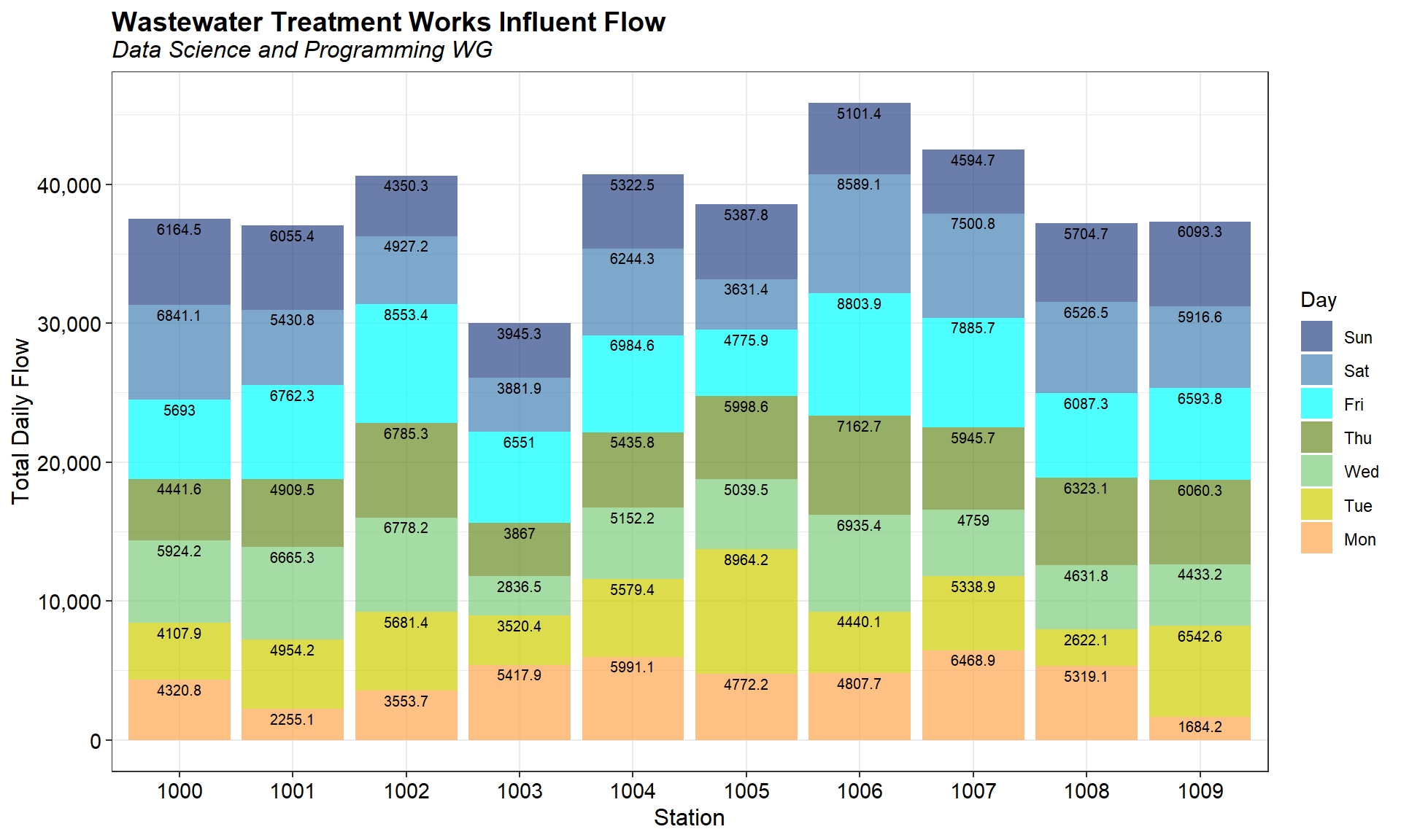
The percentage of total flow for each day and station for the entire monitoring period is shown below. Flow on Monday for Stations 1001, 1002, and 1009 is much lower than flow on the other days of the week.
# Get percentages
totals %>%
  group_by(Station, Day) %>%
  summarize(n = sum(Tot.Flow)) %>%
  mutate(rel.freq = paste0(round(100 * n/sum(n), 0), "%")) %>%
  select(-n) %>%
  spread(Day, rel.freq) %>%
  select(Station, Mon, Tue, Wed, Thu, Fri, Sat, Sun)
## # A tibble: 10 x 8
## # Groups:   Station [10]
##    Station Mon   Tue   Wed   Thu   Fri   Sat   Sun
##    <ord>   <chr> <chr> <chr> <chr> <chr> <chr> <chr>
##  1 1000    12%   11%   16%   12%   15%   18%   16%
##  2 1001    6%    13%   18%   13%   18%   15%   16%
##  3 1002    9%    14%   17%   17%   21%   12%   11%
##  4 1003    18%   12%   9%    13%   22%   13%   13%
##  5 1004    15%   14%   13%   13%   17%   15%   13%
##  6 1005    12%   23%   13%   16%   12%   9%    14%
##  7 1006    10%   10%   15%   16%   19%   19%   11%
##  8 1007    15%   13%   11%   14%   19%   18%   11%
##  9 1008    14%   7%    12%   17%   16%   18%   15%
## 10 1009    5%    18%   12%   16%   18%   16%   16%
Create bar chart of flow for each day and station
A bar chart showing flow for each day and station is shown below. Flow on Monday for Stations 1001, 1002, and 1009 is much lower than flow on the other days of the week.
# Calculate the cumulative sum of total flow
df_cumsum <- plyr::ddply(
  totals, 'Station',
  transform, label_ypos = cumsum(Tot.Flow)
)

# Bar chart of totals
ggplot(data = df_cumsum) +
  geom_bar(aes(x = Station, y = Tot.Flow, fill = reorder(Day, desc(Day))), stat = 'identity') +
  geom_text(data = df_cumsum, aes(x= Station, y = label_ypos, label = Tot.Flow),
            vjust = 1.3, color = 'black', size = 2.6) +
  scale_y_continuous(labels = function(x) format(x, big.mark = ",",
                                                 scientific = FALSE)) +
  scale_fill_manual(values = alpha(cols, 0.7)) +
  labs(title = 'Wastewater Treatment Works Influent Flow',
       subtitle = 'Data Science and Programming WG',
       fill = 'Day',
       x = 'Station',
       y = 'Total Daily Flow') +
  theme_bw() +
  theme(plot.title = element_text(margin = margin(b = 2), size = 14, hjust = 0.0,
                                  color = 'black', face = quote(bold)),
        plot.subtitle = element_text(margin = margin(b = 5), size = 12, hjust = 0.0,
                                     color = 'black', face = quote(italic)),
        axis.title = element_text(size = 12, color = 'black'),
        axis.text.x = element_text(size = 11, color = 'black'),
        axis.text.y = element_text(size = 11, color = 'black'))
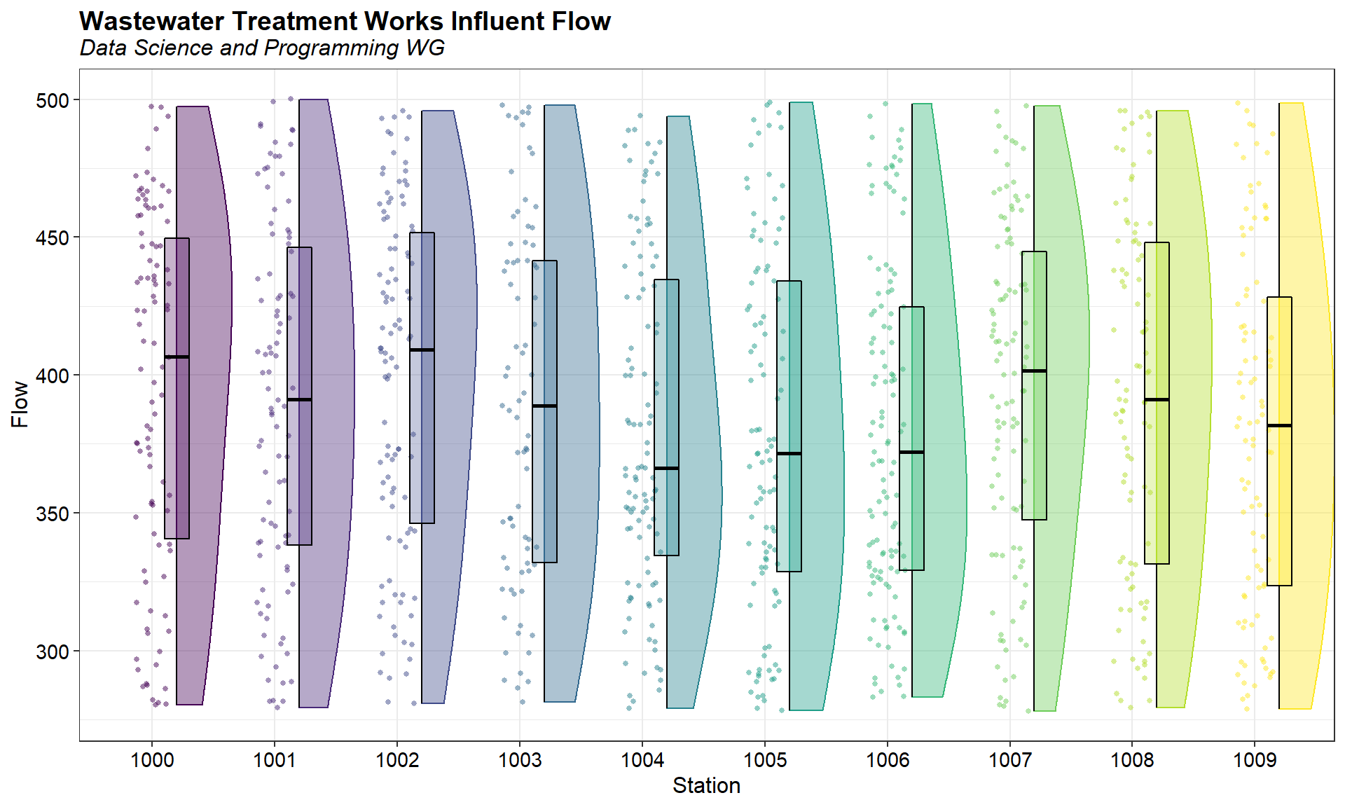
Visually inspect distribution of data
A combination box plot and half of a violin plot of the daily flow for each station is shown below. A violin plot is similar to a box plot, except that it also shows the kernel probability density of the data at different values. This allows the distribution of several groups of data to be compared by displaying their densities. The distributions of the data appear similar.
# Create box plot with half violin plot
ggplot(dat, aes(x = Station, y = Flow, fill = Station, color = Station)) +
  geom_point(shape = 16, position = position_jitter(0.15),
             size = 1, alpha = 0.5) +
  geom_flat_violin(position = position_nudge(x = 0.2, y = 0),
                   adjust = 2, alpha = 0.4, trim = TRUE,
                   scale = 'width') +
  geom_boxplot(aes(x = as.numeric(Station) + 0.2, y = Flow),
               notch = FALSE, width = 0.2, varwidth = FALSE,
               outlier.shape = NA, color = 'black', alpha = 0.3,
               show.legend = FALSE) +
  labs(title = 'Wastewater Treatment Works Influent Flow',
       subtitle = 'Data Science and Programming WG',
       x = 'Station',
       y = 'Flow') +
  theme_bw() +
  scale_shape_identity() +
  theme(plot.title = element_text(margin = margin(b = 2), size = 14, hjust = 0.0,
                                  color = 'black', face = quote(bold)),
        plot.subtitle = element_text(margin = margin(b = 5), size = 12, hjust = 0.0,
                                     color = 'black', face = quote(italic)),
        axis.title = element_text(size = 12, color = 'black'),
        axis.text.x = element_text(size = 11, color = 'black'),
        axis.text.y = element_text(size = 11, color = 'black'),
        legend.position = 'none')
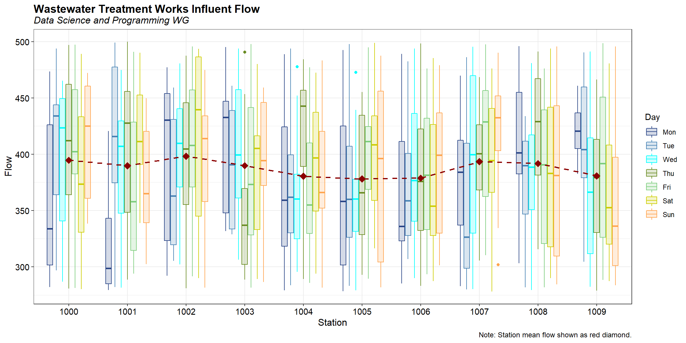
Visually inspect flow by day and station
A box plot of flow, color-coded by day of the week, for each station is shown below. Red diamonds represent the mean flow for each station. Stations 1004, 1005, and 1006 appear to be lower flow, on average, than the other stations.
# Visualize how each station is behaving
ggplot(data = dat, aes(x = Station, y = Flow)) +
  geom_boxplot(aes(color = Day, fill = Day)) +
  geom_point(data = stats, aes(x = Station, y = Mean),
             shape = 18, size = 4, color = 'red4') +
  geom_line(data = stats, aes(x = Station, y = Mean, group = 1),
            linetype = 'dashed', size = 0.8, color = 'red4') +
  scale_color_manual(values = cols) +
  scale_fill_manual(values = alpha(cols, 0.2)) +
  labs(title = 'Wastewater Treatment Works Influent Flow',
       subtitle = 'Data Science and Programming WG',
       caption = 'Note: Station mean flow shown as red diamond.',
       x = 'Station',
       y = 'Flow') +
  theme_bw() +
  theme(plot.title = element_text(margin = margin(b = 2), size = 14, hjust = 0.0,
                                  color = 'black', face = quote(bold)),
        plot.subtitle = element_text(margin = margin(b = 5), size = 12, hjust = 0.0,
                                     color = 'black', face = quote(italic)),
        plot.caption = element_text(size = 9, color = 'black'),
        axis.title = element_text(size = 12, color = 'black'),
        axis.text.x = element_text(size = 11, color = 'black'),
        axis.text.y = element_text(size = 11, color = 'black'))
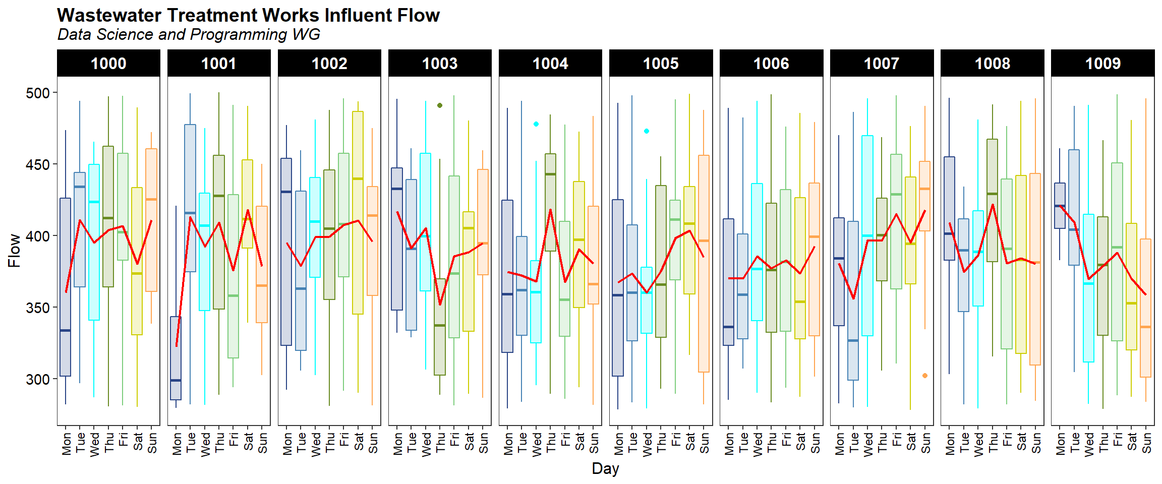
A plot of flow by day of the week, faceted on station id, is shown below. The mean flow by day of the week is shown as a red line in each facet plot. As expected, flow varies by day of the week. Flow at Station 1009 appears to decrease from a maximum on Monday to a minimum on Sunday.
# Visualize temporal behavior by station
ggplot(data = dat, aes(x = Day, y = Flow, color = Day, fill = Day)) +
  geom_boxplot() +
  stat_summary(fun = mean, geom = "line", group = 1, color = 'red', size = 0.8) +
  facet_grid(. ~ Station) +
  scale_color_manual(values = cols, 0.2) +
  scale_fill_manual(values = alpha(cols, 0.2)) +
  labs(title = 'Wastewater Treatment Works Influent Flow',
       subtitle = 'Data Science and Programming WG',
       x = 'Day',
       y = 'Flow') +
  theme_bw() +
  theme(plot.title = element_text(margin = margin(b = 2), size = 14, hjust = 0.0,
                                  color = 'black', face = quote(bold)),
        plot.subtitle = element_text(margin = margin(b = 5), size = 12, hjust = 0.0,
                                     color = 'black', face = quote(italic)),
        axis.title = element_text(size = 12, color = 'black'),
        axis.text.x = element_text(angle = 90, hjust = 1, vjust = 0.5,
                                   size = 9, color = 'black'),
        axis.text.y = element_text(size = 11, color = 'black'),
        panel.grid.major = element_blank(),
        panel.grid.minor = element_blank(),
        strip.text.x = element_text(size = 12, color = 'white', face = 'bold'),
        strip.background = element_rect(color = 'black', fill = 'black'),
        legend.position = 'none')
Statistical comparisons
Use the R package ggstatsplot to statistically compare total flow between stations and day of the week. The function provided below is used to create a graphical presentation of the data containing the details from the statistical tests.
# Load library
library(ggstatsplot)

# Function to create ggbetweenstats plot
get_ggstats <- function(d, x, y, xlabel, mtitle) {
  p <- ggbetweenstats(
    data = d,
    x = !!x, y = !!y,
    type = 'nonparametric',
    pairwise.comparisons = TRUE,
    conf.level = 0.95,
    p.adjust.method = 'BH',
    pairwise.display = 's',
    centrality.point.args = list(size = 3, color = 'darkred'),
    package = "RColorBrewer",
    palette = 'Spectral',
    xlab = xlabel,
    ylab = 'Flow',
    title = mtitle
  )
  return(p)
}
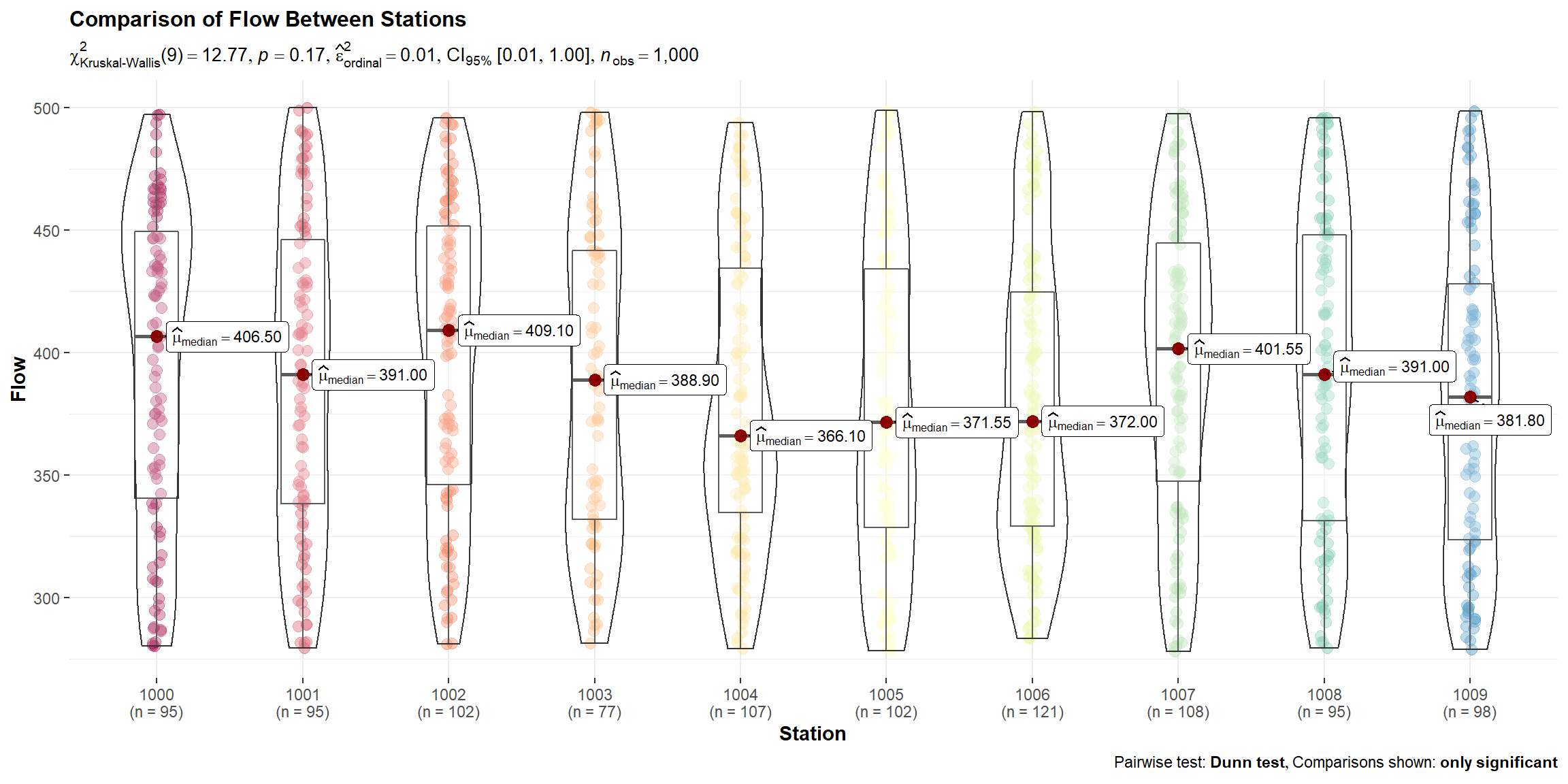
Use the function to compare total flow across stations. Total daily flow is statistically similar for all stations.
p <- get_ggstats(
  d = dat,
  x = quo(Station),
  y = quo(Flow),
  xlabel = 'Station',
  mtitle = 'Comparison of Flow Between Stations'
)
p
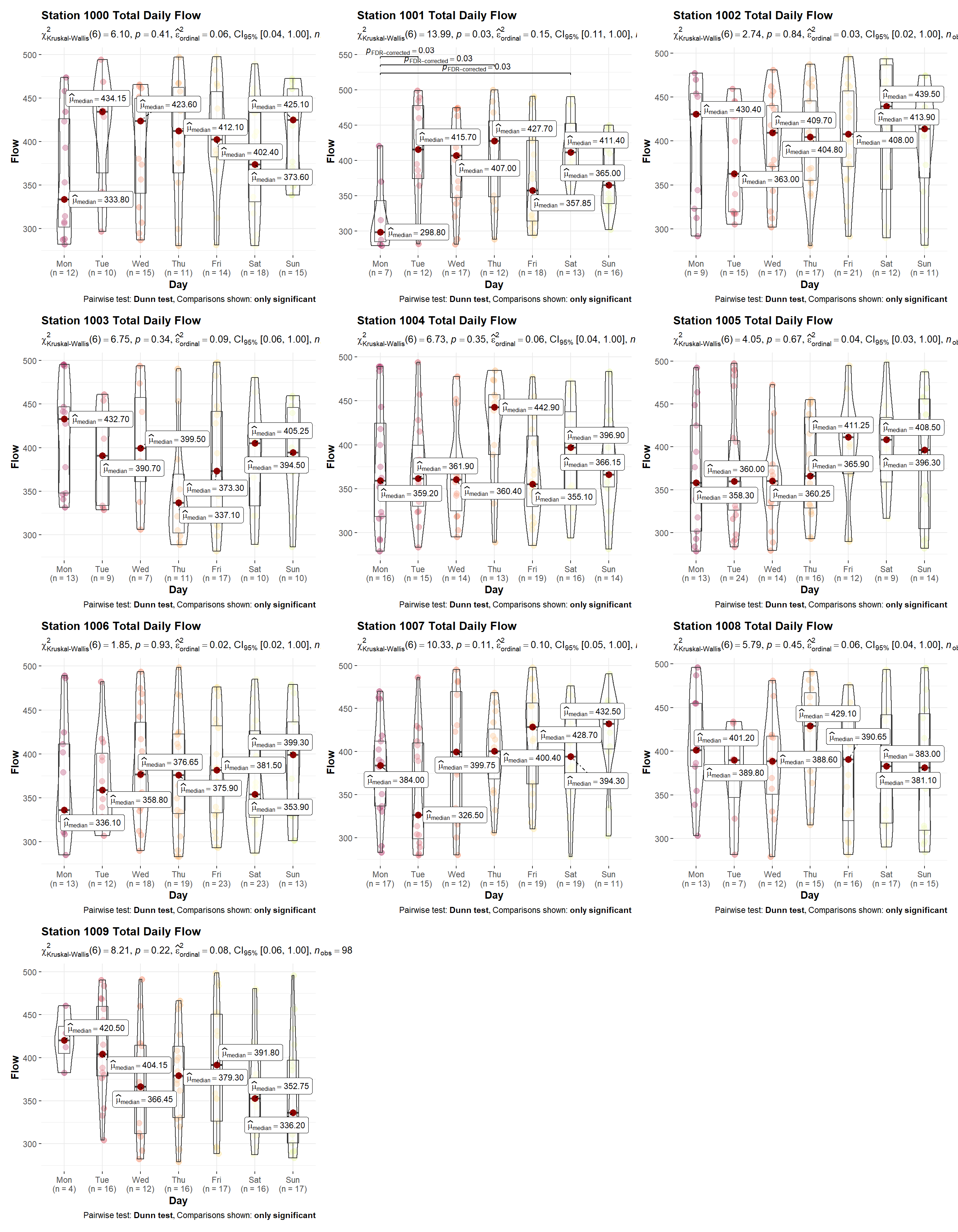
Compare the total daily flow by day of the week for each individual station. Daily flow appears to be statistically different for Station 1001; flow on Monday is less than flow on Tuesday, Thursday, and Saturday. No other differences are noted.
# Initialize parameters
stations <- sort(unique(dat$Station))
plots <- list()
i <- 1

# Create plots for each station
for (sta in stations) {
  plots[[i]] <- get_ggstats(
    d = subset(dat, Station == sta),
    x = quo(Day),
    y = quo(Flow),
    xlabel = 'Day',
    mtitle = paste('Station', sta, 'Total Daily Flow')
  )
  i <- i + 1
}

# Show plots
library(patchwork)
wrap_plots(
  plots[[1]], plots[[2]], plots[[3]],
  plots[[4]], plots[[5]], plots[[6]],
  plots[[7]], plots[[8]], plots[[9]],
  plots[[10]],
  ncol = 3
)
- Posted on:
- April 7, 2022
- Length:
- 10 minute read, 2116 words
- See Also: