U.S. Bureau of Labor Statistics Employment Situation Report Data Trends
By Charles Holbert
March 16, 2022
Introduction
On Friday March 4th, the U.S. Bureau of Labor Statistics (BLS) released its monthly Employment Situation Report (https://www.bls.gov). The Employment Situation Report presents statistics from two major surveys, the Current Population Survey and the Current Employment Statistics survey. The household survey provides information on the labor force, employment, and unemployment. The establishment survey provides information on employment, hours, and earnings of employees on nonfarm payrolls.
Generally, the Employment Situation Report provides statistics and data on the direction of wage and employment trends. The report is widely anticipated as many investment firms issue estimates of these employment numbers, and these forecasts are in turn used by businesses for future decision making. The report may impact corporate confidence, and therefore future business and hiring decisions.
This post will review the U.S. macroeconomic trends by creating several time-series plots of the BLS data. The methods and time-series plots presented here are based on the inspiring work of economist Dr. Len Kiefer. Consider this an exploratory data analysis using time-series plots to visually identify essential economic information contained in the BLS report. This post also provides users a mechanism to download data from the BLS and code that can be used to quickly view and explore the data using the R statistical programming language.
Data
The BLS Employment Situation Report data are available in the St. Louis Federal Reserve Bank Economic Database (FRED). The data also are available in a flat-file format that can be downloaded directly from the BLS webpage. The code below will retrieve the data from FRED.
# Load libraries
library(tidyverse)
library(tidyquant)
library(scales)
library(tibbletime)
library(data.table)
library(cowplot)

# Set up tickers
tickers<- c(
  'PAYEMS',     # nonfarm payroll employment
  'UNRATE',     # unemployment rate
  'CIVPART',    # civilian labor force participation rate
  'EMRATIO',    # employment-to-population ratio
  'NROU'        # natural rate of unemployment from U.S. Congressional Budget Office
)

mynames <- c(
  'Nonfarm Payroll Employment',
  'Unemploymen Rate',
  'Labor Force Participation Rate',
  'Employment-to-Population Ratio',
  'Natural Rate of Unemployment'
)

mytickers <- data.frame(
  symbol = tickers,
  varname = mynames,
  stringsAsFactors = FALSE
)

# Download data via FRED
df <- tq_get(
  tickers,                       # get selected symbols
  get = 'economic.data',         # use FRED
  from = '1948-01-01')           # go from 1954 forward

df <- left_join(df, mytickers, by = 'symbol')
Now that we have downloaded the BLS data using FRED, let’s process the data for analysis.
df2 <- df %>%
  select(-varname) %>%
  spread(symbol, price)

# Convert quarterly natural rate (NROU) data to monthly data by "filling down"
# using na.locf function in zoo package.
df2 <- df2 %>%
  mutate(NROU2 = na.locf(NROU, na.rm = F)) %>%
  mutate(
    UGAP2 = UNRATE - NROU2,
    dj = c(NA, diff(PAYEMS)),
    # create indicators for shaded plot
    up = ifelse(UNRATE >= NROU2, UNRATE, NROU2),
    down = ifelse(UNRATE < NROU2, UNRATE, NROU2)
  )

# Set up recession indicators
recessions.df = read.table(
  textConnection(
    "Peak, Trough
    1948-11-01, 1949-10-01
    1953-07-01, 1954-05-01
    1957-08-01, 1958-04-01
    1960-04-01, 1961-02-01
    1969-12-01, 1970-11-01
    1973-11-01, 1975-03-01
    1980-01-01, 1980-07-01
    1981-07-01, 1982-11-01
    1990-07-01, 1991-03-01
    2001-03-01, 2001-11-01
    2007-12-01, 2009-06-01"
  ),
  sep = ',', colClasses = c('Date', 'Date'), header = TRUE
)
Time-Series Plots
Alhough there are more detailed and complex types of analyses that can be performed, trends in these data can be quite informative. Implementation of simple visual analysis techniques is useful for rapidly discovering patterns in the data that may require further analysis. The plots shown below offer a quick look at the current and historical data.
Employment Growth
Let’s start by looking at monthly nonfarm job gains. Nonfarm payroll data is analyzed closely because of its importance in identifying trends related to the rate of economic growth and inflation. If nonfarm payrolls are expanding, the increase is an indication that the economy is growing. However, if increases in nonfarm payroll occur at a fast rate, this may lead to an increase in inflation and that may be viewed as a negative for the economy. Data on wage growth and the rate of unemployed, which are also included in the monthly jobs report, help shape inflation expectations and estimates for future economic growth.
# Let's plot monthly nonfarm job gains.
ggplot(data = filter(df2, year(date) > 1949),
       aes(x = date, y = dj,
           color = ifelse(dj > 0, 'up m/m',
                        ifelse(dj == 0, 'no change', 'down m/m')),
           fill = ifelse(dj > 0, 'up m/m',
                       ifelse(dj == 0, 'no change', 'down m/m')))) +
  geom_col(alpha = 0.85, color = NA) +
  geom_rug(sides = 'b') +
  scale_x_date(lim = as.Date(c('1950-01-01','2018-12-31')),
               date_breaks = '5 years',
               date_labels = '%Y') +
  scale_y_continuous(limits = c(-800, 800),
                     breaks = seq(-800, 800, by = 200),
                     labels = scales::comma,sec.axis = dup_axis()) +
  scale_color_manual(values = c('down m/m'  = '#d73027',
                                'no change' = 'grey',
                                'up m/m'    = '#4575b4'),
                     name = 'Monthly change') +
  scale_fill_manual(values = c('down m/m'   = '#d73027',
                                'no change' = 'grey',
                                'up m/m'    = '#4575b4'),
                     name = 'Monthly change') +
  labs(title = 'Job Growth',
       subtitle = 'Monthly change in U.S. nonfarm employment (1000s, SA)',
       caption = 'Source: U.S. Bureau of Labor Statistics',
       x = NULL,
       y = NULL) +
  theme_minimal() +
  theme(plot.title = element_text(margin = margin(b = 0), size = 12,
                       hjust = 0, color = 'black', face = 'bold'),
        plot.subtitle = element_text(margin = margin(b = 5), size = 10,
                          hjust = 0, color = 'black', face = 'italic'),
        plot.caption = element_text(size = 7, hjust = 0),
        axis.text.x = element_text(size = 8, color = 'black'),
        axis.text.y = element_text(size = 8, color = 'black'),
        legend.position = 'none')
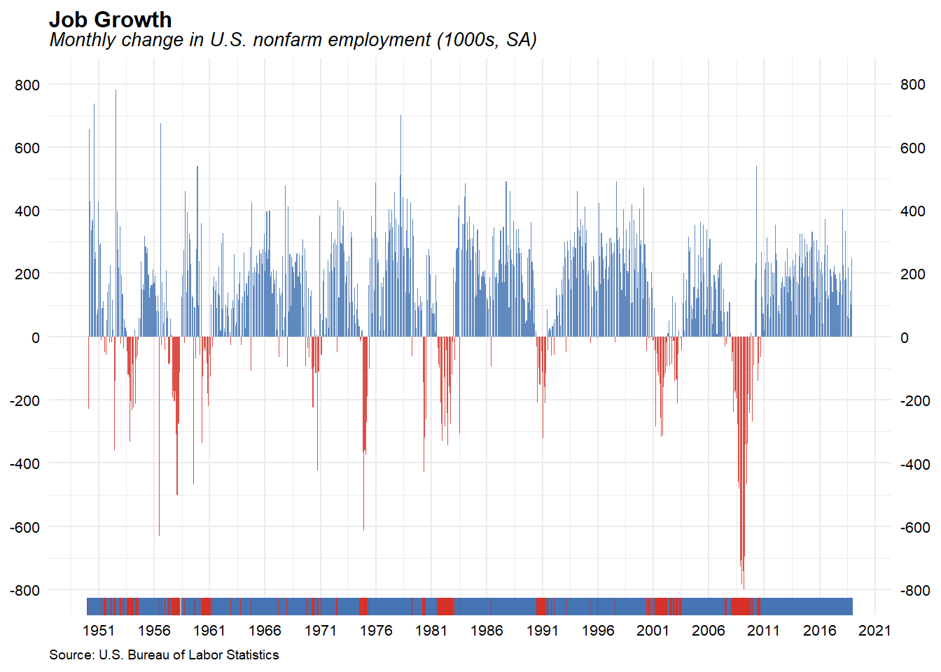
The BLS reported that total nonfarm payroll employment rose by 678,000 in February, and the unemployment rate edged down to 3.8 percent in February with the number of unemployed persons at 6.3 million. In February 2020, prior to the coronavirus (COVID-19) pandemic, the unemployment rate was 3.5 percent, and unemployed persons numbered 5.7 million. The BLS also reported that among those not in the labor force who wanted a job, the number of persons marginally attached to the labor force was essentially unchanged at 1.5 million. The number of discouraged workers, a subset of the marginally attached who believed that no jobs were available for them, was also essentially unchanged over the month, at 391,000.
Unemployment Rate
The difference between the unemployment rate and the natural rate of unemployment is the unemployment gap. The natural rate of unemployment is the unemployment rate that would exist in a growing and healthy economy. The economy is considered to be at full employment when the actual unemployment rate is equal to the natural rate. The unemployment gap measures how far the economy is from potential. A positive unemployment gap is neither necessary nor sufficient for a recession but a positive gap has preceded the past three recessions.
# Create plot subtitle
plot_subtitle <- paste(
  'Solid line Unemployment Rate, dotted line Long-term Natural Rate',
  'of Unemployment'
)

# Create plot caption
plot_caption <- paste(
  'Source: U.S. Bureau of Labor Statistics, U.S. Congressional Budget Office,',
  'shaded bars NBER Recessions\nNatural Rate of Unemployment (Long-Term)',
  'retrieved from FRED Federal Reserve Bank of St. Louis;\n',
  'https://fred.stlouisfed.org/series/NROU, January 8, 2022.'
)

# Create plot
ggplot(data = filter(df2, !is.na(NROU2)), aes(x = date, y = UNRATE)) +
  geom_rect(data = recessions.df, inherit.aes = F,
            aes(xmin = Peak, xmax = Trough, ymin = -Inf, ymax = +Inf),
            fill = 'darkgray', alpha = 0.5) +
  geom_line(color = 'black') +
  geom_line(linetype = 1, aes(y = NROU2)) +
  geom_ribbon(aes(ymin = UNRATE, ymax = down), fill = '#d73027', alpha = 0.5) +
  geom_ribbon(aes(ymin = UNRATE, ymax = up), fill = '#4575b4', alpha = 0.5)  +
  geom_rug(aes(color = ifelse(UNRATE <= NROU2, 'Below or Equal', 'Above')),
           sides = 'b') +
  scale_x_date(date_breaks = '5 years',
               date_labels = '%Y') +
  scale_y_continuous(limits = c(0, 16),
                     breaks = seq(0, 16, by = 4),
                     sec.axis = dup_axis()) +
  scale_color_manual(values = c('Above'          = '#d73027',
                                'Below or Equal' = '#4575b4'),
                     name = 'Unemployment Rate Above/Below Natural Rate') +
  labs(title = 'U.S. Unemployment Rate vs Natural Rate of Unemployment',
       subtitle = plot_subtitle,
       caption = plot_caption,
       x = NULL,
       y = 'Percent') +
  theme_minimal() +
  theme(plot.title = element_text(margin = margin(b = 0), size = 12,
                       hjust = 0, color = 'black', face = 'bold'),
        plot.subtitle = element_text(margin = margin(b = 2), size = 10,
                          hjust = 0, color = 'black', face = 'italic'),
        plot.caption = element_text(size = 7, hjust = 0),
        axis.title.x = element_text(size = 9, color = 'black'),
        axis.title.y = element_text(size = 9, color = 'black'),
        axis.text.x = element_text(size = 9, color = 'black'),
        axis.text.y = element_text(size = 9, color = 'black'),
        legend.title = element_text(size = 8),
        legend.text = element_text(size = 8),
        legend.position = 'top')
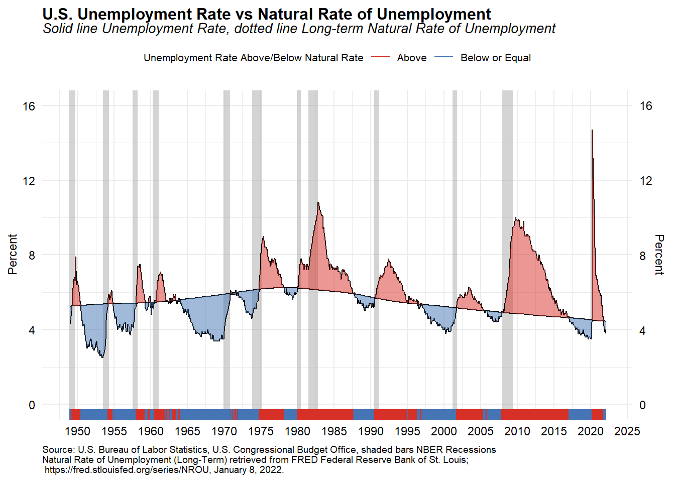
The unemployment rate is below the Congressional Budget Office’s estimate of the natural rate of unemployment, but wage growth has been slow. This is indicative of an economy below its average frictional and structural unemployment levels. Because the natural rate of unemployment is the unemployment rate that exists when the economy is in neither a boom nor a recession, an actual unemployment rate that is lower than the natural rate indicates inflationary pressure.
Labor Force Participation
Let’s look at the labor force participation rate. The labor force participation rate is the percentage of the civilian noninstitutional population 16 years and older that is working or actively looking for work. It is an important labor market measure because it represents the relative amount of labor resources available for the production of goods and services.
# Create plot caption
plot_caption <- paste(
  'Source: U.S. Bureau of Labor Statistics, shaded bars NBER',
  'Recessions\nCivilian Labor Force Participation Rate [CIVPART], retrieved',
  'from FRED, Federal Reserve Bank of St. Louis;',
  '\nhttps://fred.stlouisfed.org/series/CIVPART, Januray 8, 2022.'
)

ggplot(data = df2, aes(x = date, y = CIVPART, label = CIVPART)) +
  geom_rect(data = recessions.df, inherit.aes = F,
            aes(xmin = Peak, xmax = Trough, ymin = -Inf, ymax = +Inf),
            fill = 'darkgray', alpha = 0.5) +
  geom_line(size = 0.8) +
  geom_point(data = filter(df2, date == max(df2$date)), size = 2,
             alpha = 0.75) +
  geom_text(data = filter(df2, date == max(df2$date)), size = 4,
            fontface = 'bold', nudge_y = 0.15) +
  scale_x_date(date_breaks = '2 years',
               date_labels = '%Y') +
  scale_y_continuous(sec.axis = dup_axis()) +
  coord_cartesian(xlim = as.Date(c('2000-01-01', '2022-03-01')),
                  ylim = c(60, 68)) +
  labs(title = 'Labor Force Participation Rate',
       subtitle = 'Percentage points (seasonally adjusted)',
       caption = plot_caption,
       x = NULL,
       y = NULL) +
  theme_minimal() +
  theme(plot.title = element_text(margin = margin(b = 0), size = 12,
                       hjust = 0, color = 'black', face = 'bold'),
        plot.subtitle = element_text(margin = margin(b = 5), size = 10,
                          hjust = 0, color = 'black', face = 'italic'),
        plot.caption = element_text(size = 7, hjust = 0),
        axis.text.x = element_text(size = 9, color = 'black'),
        axis.text.y = element_text(size = 9, color = 'black'),
        legend.position = 'none')
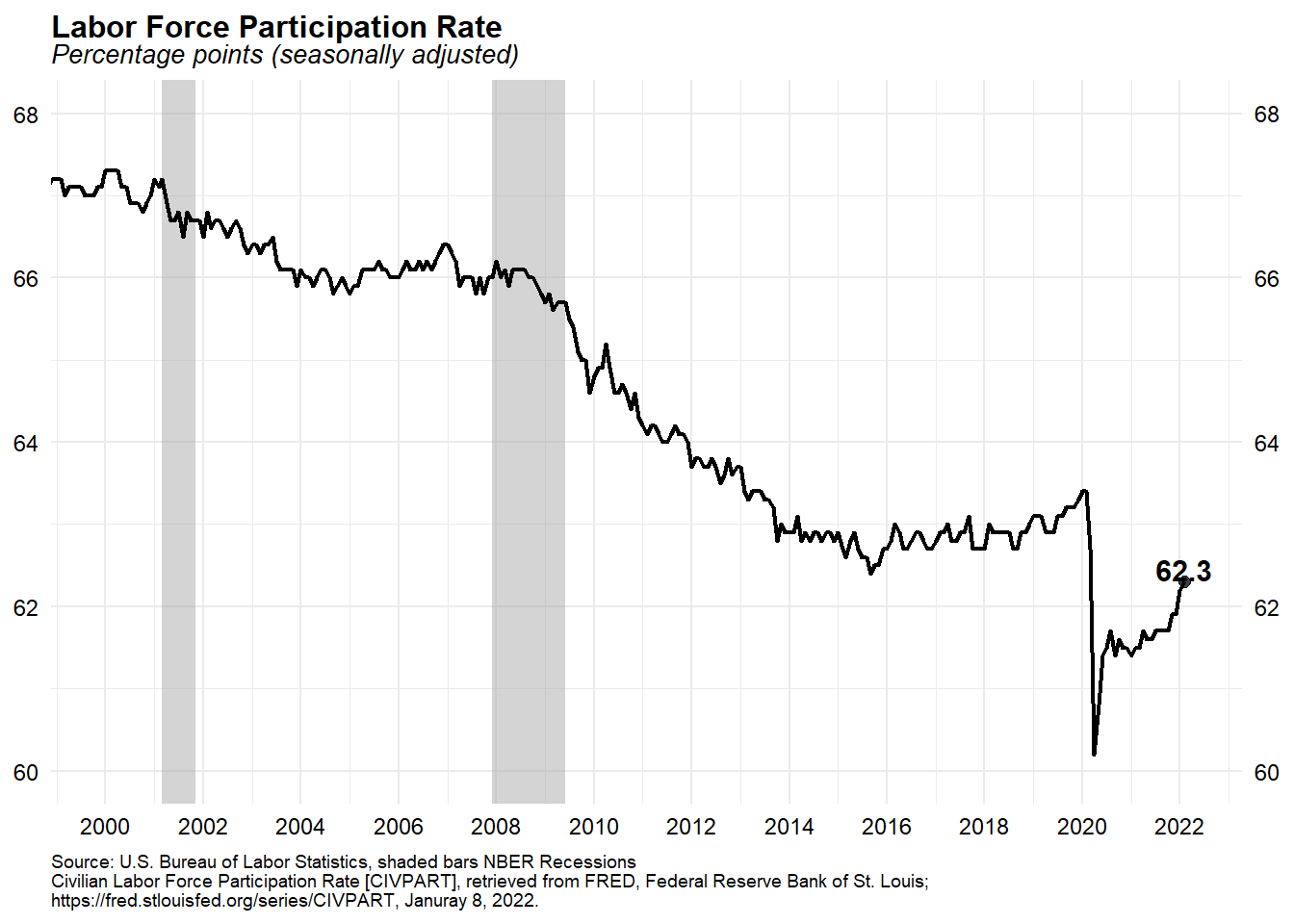
The labor force participation rate, which measures the share of people who are working or actively looking for work, hasn’t changed much since June 2020. In February, the participation rate edged up to 62.3 percent, remaining 1.5 percentage points lower than in February 2020 before the pandemic started.
Employment-Population Ratio
Let’s look at the employment-population ratio. The employment-population ratio is the portion of the population that is employed. This ratio is used primarily as a measure of job holders and to track the pace of job creation, relative to the adult population, over time. Because it takes into account both the impacts of labor force participation and unemployment, it is a useful summary measure when those forces place offsetting pressures on employment.
# Create plot caption
plot_caption <- paste(
  'Source: U.S. Bureau of Labor Statistics, shaded bars NBER Recessions',
  '\nEmployment-Population Ratio [EMRATIO], retrieved from FRED, Federal',
  'Reserve Bank of St. Louis;',
  '\nhttps://fred.stlouisfed.org/series/EMRATIO, Januray 8, 2022.'
)

# Create plot
ggplot(data = df2, aes(x = date, y = EMRATIO, label = EMRATIO)) +
  geom_rect(data = recessions.df, inherit.aes = F,
            aes(xmin = Peak, xmax = Trough, ymin = -Inf, ymax = +Inf),
            fill = 'darkgray', alpha = 0.5) +
  geom_line(size = 0.8) +
  geom_point(data = filter(df2, date == max(df2$date)), size = 2, alpha = 0.75) +
  geom_text(data = filter(df2, date == max(df2$date)), size = 4,
            fontface = 'bold', nudge_y = 0.25) +
  scale_x_date(date_breaks = '2 years',
               date_labels = '%Y') +
  scale_y_continuous(sec.axis = dup_axis()) +
  coord_cartesian(xlim = as.Date(c('2000-01-01', '2022-03-01')),
                  ylim = c(50, 66)) +
  labs(title = 'Employment-Population Ratio',
       subtitle = 'Percentage points (seasonally adjusted)',
       caption = plot_caption,
       x = NULL,
       y = NULL) +
  theme_minimal() +
  theme(plot.title = element_text(margin = margin(b = 0), size = 12,
                       hjust = 0, color = 'black', face = 'bold'),
        plot.subtitle = element_text(margin = margin(b = 5), size = 10,
                          hjust = 0, color = 'black', face = 'italic'),
        plot.caption = element_text(size = 7, hjust = 0),
        axis.title.x = element_text(size = 9, color = 'black'),
        axis.title.y = element_text(size = 9, color = 'black'),
        axis.text.x = element_text(size = 9, color = 'black'),
        axis.text.y = element_text(size = 9, color = 'black'),
        legend.position = 'none')
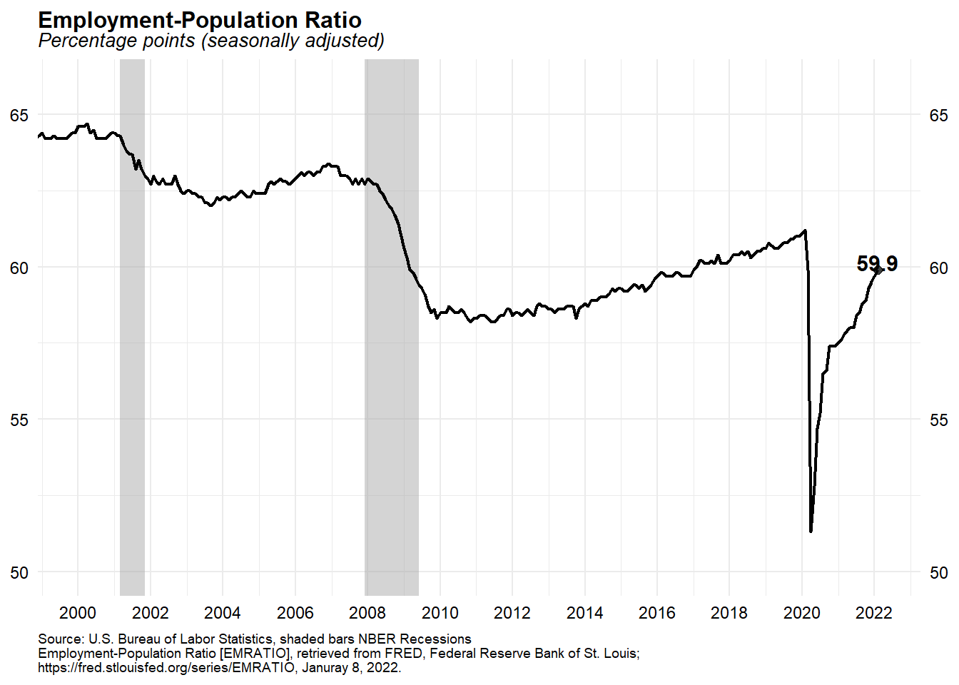
The employment-population ratio was 59.9 percent in February, which is 1.3 percentage points below its February 2020 level.
Labor Force Participation Rate: Prime Working Age (25 to 54)
The labor force participation ratio is partially affected by an aging population. It is important to look at the prime-age (those ages 25 to 54) labor force participation rate because it is less impacted by changes in educational enrollment and the natural slowdown in labor force participation caused by the aging of the population and retirements. The data is available to download from the BLS website.
# Get data direct from BLS
dfs <- fread('https://download.bls.gov/pub/time.series/ln/ln.series')

codes <- dfs[grepl('Participation Rate', series_title) &   # use regular expression
             ages_code == 33 &                             # only ags 25 to 54
             periodicity_code == 'M' &                     # only monthly frequence
             seasonal == 'S'                               # only Seasonally adjusted
           ]
codes$var <- c('All', 'Men', 'Women')
codes <- select(codes, series_id, series_title, var)

# Get all data (large file)
df.all <- fread('https://download.bls.gov/pub/time.series/ln/ln.data.1.AllData')

# Filter data
dfp <- df.all[series_id %in% codes$series_id, ]

# Create date variable
dfp[,month:=as.numeric(substr(dfp$period, 2, 3))]
dfp$date <- as.Date(ISOdate(dfp$year, dfp$month, 1))   # set up date variable
dfp$v <- as.numeric(dfp$value)

# Join on variable names, drop unused variables, convert to data.table
dfp <- left_join(
  dfp,
  select(codes, series_id, series_title, var),
  by = 'series_id'
  ) %>%
  select(series_id, series_title, var, date, v) %>%
  data.table()

str(dfp)
## Classes 'data.table' and 'data.frame':	2670 obs. of  5 variables:
##  $ series_id   : chr  "LNS11300060" "LNS11300060" "LNS11300060" "LNS11300060" ...
##  $ series_title: chr  "(Seas) Labor Force Participation Rate - 25-54 yrs." "(Seas) Labor Force Participation Rate - 25-54 yrs." "(Seas) Labor Force Participation Rate - 25-54 yrs." "(Seas) Labor Force Participation Rate - 25-54 yrs." ...
##  $ var         : chr  "All" "All" "All" "All" ...
##  $ date        : Date, format: "1948-01-01" "1948-02-01" ...
##  $ v           : num  64.2 64.6 64.3 64.8 64.3 65 65.4 65 65.4 65 ...
##  - attr(*, ".internal.selfref")=<externalptr>
Now that we have downloaded and prepped the data, let’s plot the labor force participation ratio of prime age men and women.
\vspace{8pt}
# Create vector for colors
cols <- c(
  '#2A4586',
  'olivedrab4',
  'red4'
)

# Create plot
ggplot(data = dfp, aes(x = date, y = v, color = var, label = var)) +
  geom_rect(data = recessions.df, inherit.aes = F,
            aes(xmin = Peak, xmax = Trough, ymin = -Inf, ymax = +Inf),
            fill = 'darkgray', alpha = 0.5) +
  geom_line(size = 0.8) +
  geom_point(data = filter(dfp, date == max(dfp$date)), size = 2, alpha = 0.75) +
  geom_text(data = filter(dfp, date == max(dfp$date)), size = 4,
            fontface = 'bold', nudge_y = 2) +
  scale_x_date(date_breaks = '5 years',
               date_labels = '%Y') +
  scale_y_continuous(sec.axis = dup_axis()) +
  scale_color_manual(values = cols) +
  labs(title = 'Labor Force Participation Rate: Prime Working Age (25-54)',
       subtitle = 'Percentage points (seasonally adjusted)',
       caption = 'Source: U.S. Bureau of Labor Statistics, shaded bars NBER Recessions',
       x = NULL,
       y = NULL) +
  theme_minimal() +
  theme(plot.title = element_text(margin = margin(b = 0), size = 12,
                       hjust = 0, color = 'black', face = 'bold'),
        plot.subtitle = element_text(margin = margin(b = 5), size = 10,
                          hjust = 0, color = 'black', face = 'italic'),
        plot.caption = element_text(size = 7, hjust = 0),
        axis.text.x = element_text(size = 9, color = 'black'),
        axis.text.y = element_text(size = 9, color = 'black'),
        legend.text = element_text(size = 8),
        legend.position = 'none')
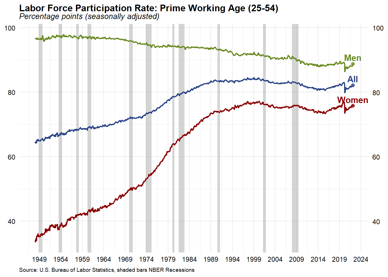
Participation among prime-age men peaked in 1954, declined only slightly until the mid-1960s, and then began to decline in earnest in the decade between 1965 and 1975. Since then, participation has steadily decreased. Participation among prime-age women increased between 1949 and the 1990s. Beginning in around 1990, the advances in women’s labor force participation stopped. The rate flattened and then began to decline until around 2015, at which time, it began to increase again. A major factor that contributed to the growth of the U.S. labor force in the second half of the twentieth century was the remarkable increase in the labor force participation rate of women.
Let’s focus on the labor force participation ratio of prime age men and women since 2000.
# Create plot of recent data
ggplot(data = dfp, aes(x = date, y = v, color = var, label = var)) +
  geom_rect(data = recessions.df, inherit.aes = F,
            aes(xmin = Peak, xmax = Trough, ymin = -Inf, ymax = +Inf),
            fill = 'darkgray', alpha = 0.5) +
  geom_line(size = 0.8) +
  geom_point(data = filter(dfp, date == max(dfp$date)), size = 2, alpha = 0.75) +
  geom_text(data = filter(dfp, date == max(dfp$date)), size = 4,
            fontface = 'bold', nudge_y = 1) +
  scale_x_date(date_breaks = '2 years',
               date_labels = '%Y') +
  scale_y_continuous(sec.axis = dup_axis()) +
  coord_cartesian(xlim = as.Date(c('2000-01-01', '2022-03-01')),
                  ylim = c(70, 95)) +
  scale_color_manual(values = cols) +
  labs(title = 'Labor Force Participation Rate: Prime Working Age (25-54)',
       subtitle = 'Percentage points (seasonally adjusted)',
       caption = 'Source: U.S. Bureau of Labor Statistics, shaded bars NBER Recessions',
       x = NULL,
       y = NULL) +
  theme_minimal() +
  theme(plot.title = element_text(margin = margin(b = 0), size = 12,
                       hjust = 0, color = 'black', face = 'bold'),
        plot.subtitle = element_text(margin = margin(b = 5), size = 10,
                          hjust = 0, color = 'black', face = 'italic'),
        plot.caption = element_text(size = 7, hjust = 0),
        axis.text.x = element_text(size = 9, color = 'black'),
        axis.text.y = element_text(size = 9, color = 'black'),
        legend.text = element_text(size = 8),
        legend.position = 'none')
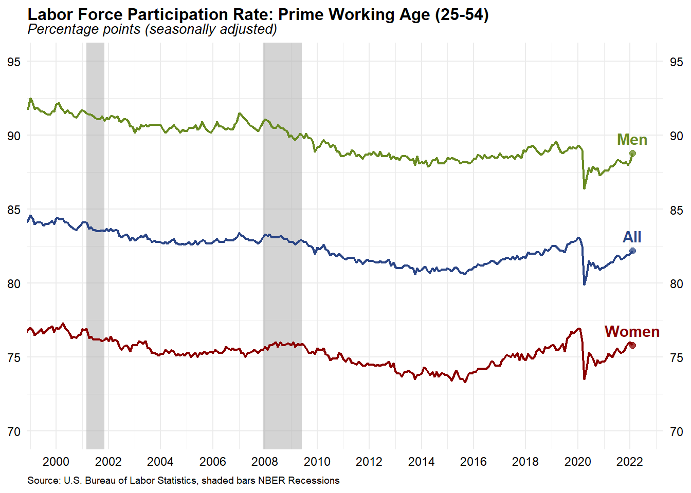
Participation of people in their prime working years remained constant at 82.2 percent for February, but this value is depressed compared with the rate before the pandemic. In February 2020, 83 percent of those 25 to 54 years old were in the labor force. The rates for men and women were 88.8 and 75.8 percent, respectively.
Conclusions
The United States lost a total of 22 million jobs in March and April of 2020. The number of jobs are 2.1 million shy of pre-pandemic levels in February 2020. According to the BLS, nonfarm payrolls grew by 678,000, while the unemployment rate fell slightly to 3.8 percent in February 2022. Wages rose 0.03 percent in February while labor force participation stayed flat, a sign of growing demand for workers. There are roughly 1.7 million workers who left the labor force in 2020 that are not counted in the unemployment rate. The unemployment rate is now only 0.3 percentage points higher than it was prior to the pandemic. However, with 1.7 million fewer people in the labor force than would be expected given the state of the economy, the labor market is less recovered than the unemployment rate would suggest.
- Posted on:
- March 16, 2022
- Length:
- 15 minute read, 3181 words
- See Also: