Problems Fitting a Nonlinear Model Using Log-Transformation
By Charles Holbert
June 19, 2018
Introduction
Power-law relationships are one of the most common patterns in the environmental. They have been documented in a variety of different areas including biology, ecology, physiology, and the environmental sciences. Conventional analysis of power-law data uses the fact that applying a natural logarithm transformation yields a linear relationship, allowing log-transformed data to be modeled using linear regression. However, analysis on logarithmic scales is highly dependent upon the processes that generated the data. Results from the linearization of a power-law model can be significantly different than those based on an analysis conducted on the original scale of measurement using nonlinear regression.
This post presents an example of the problems that can occur when fitting a nonlinear model by transforming to linearity using natural logarithms. Data will be fit using linear regression of the log-transformed data, followed by back-transformation of the fitted model. The same data will be fit using nonlinear regression on the raw, untransformed data.
Data
Let’s create a data set x and y where x is measured exactly, while measurements of y are affected by additive, symmetric, zero-mean errors.
# Create data
x <- c(
  5.72, 4.22, 5.72, 3.59, 5.04, 2.66, 5.02, 3.11, 0.13, 2.26,
  5.39, 2.57, 1.20, 1.82, 3.23, 5.46, 3.15, 1.84, 0.21, 4.29,
  4.61, 0.36, 3.76, 1.59, 1.87, 3.14, 2.45, 5.36, 3.44, 3.41
)

y <- c(
  2.66, 2.91, 0.94, 4.28, 1.76, 4.08, 1.11, 4.33, 8.94, 5.25,
  0.02, 3.88, 6.43, 4.08, 4.90, 1.33, 3.63, 5.49, 7.23, 0.88,
  3.08, 8.12, 1.22, 4.24, 6.21, 5.48, 4.89, 2.30, 4.13, 2.17
)
Let’s also assume that these data follow a first-order decay model that is expressed mathematically as:
$${y(x) = b0 \cdot e^{b1 \cdot x}}$$
where
b0 = initial value of y at x = 0;
y(x) = value of y as a function of x; and
b1 = first-order rate constant.
This type of equation is used to model the apparent rate of natural attenuation, a consequence of both biodegradation and abiotic processes, of organic contaminants in groundwater. For example, Newell et al. (2006) evaluated the use of different types of attenuation rates for monitored natural attenuation and concluded that first-order concentration versus time rate constants should be used for estimating how quickly groundwater cleanup goals will be met at sites undergoing environmental remediation. Additionally, the U.S. Environmental Protection Agency recommends transforming groundwater concentration data by taking the natural logarithms of the data and performing a linear regression on the transformed data as a function of time to determine attenuation rates (Newell et al. 2002; Wilson 2011).
Taking the natural logarithms, the rate equation becomes:
$${ln[y(x)] = ln[b0] + b1 \cdot x}$$
This can now be fit using linear regression where the coefficients in the untransformed space are given by exp[ln(b0)] and b1.
Regression Analysis
Let’s use nonlinear regression to fit the first-order decay model.
# Nonlinear regression on raw data
(nlfit <- nls(y ~ b0*exp(b1*x), start = list(b0 = max(y), b1 = 1)))
## Nonlinear regression model
##   model: y ~ b0 * exp(b1 * x)
##    data: parent.frame()
##      b0      b1
##  8.8145 -0.2885
##  residual sum-of-squares: 29.03
##
## Number of iterations to convergence: 10
## Achieved convergence tolerance: 1.739e-06
Now, let’s use linear regression to fit the first-order decay model using log-transformation.
(linfit <- lm(log(y) ~ x))
##
## Call:
## lm(formula = log(y) ~ x)
##
## Coefficients:
## (Intercept)            x
##      2.4792      -0.4462
# Get intercept
exp(linfit$coeff[1])
## (Intercept)
##     11.9312
The coefficients based on nonlinear regression of the untransformed data are b0 = 8.815 and b1 = -0.289. For linear regression on the transformed data, the coefficients are b0 = 11.93 and b1 = -0.446.
Let’s plot the data with the model fits.
# Load libraries
library(reshape2)
library(ggplot2)

# New x-values for plotting predictions
newx <- seq(0, 6, length = 101)

# Use nonlinear regression coefficients to get new y values
b0 <- coef(nlfit)[[1]]
b1 <- coef(nlfit)[[2]]
y1 <- b0*exp(b1*newx)

# Use linear regression coefficients to get new y values
b0 <- exp(linfit$coeff[1])
b1 <- linfit$coeff[2]
y2 <- b0*exp(b1*newx)

# Create dataframe and use dcast from reshape to change from wide to long format
pred <- data.frame(cbind(newx, y1, y2))
pred_long <- melt(pred, id = 'newx')

# Create plot
p <- ggplot(data = pred_long) +
  geom_line(aes(x = newx, y = value, color = variable), size = 1) +
  geom_point(data = data.frame(cbind(x, y)), aes(x = x, y = y),
             pch = 16, size = 3) +
  labs(title = 'Fitting Nonlinear Models by Transforming to Linearity',
       subtitle = 'Measurements of y affected by additive, symmetric, zero-mean errors',
       color = NULL,
       x = '\nx',
       y = 'y\n') +
  scale_x_continuous(limits = c(0, 6),
                     breaks = seq(0, 6, by = 1)) +
  scale_y_continuous(limits = c(0, 12),
                     breaks = seq(0, 12, by = 2)) +
  scale_color_manual(values = c('y1' = 'red',
                                'y2'  = 'blue'),
                     labels = c('y1' = 'Nonlinear fit on raw data',
                                'y2'  = 'Linear fit on log scale')) +
  theme_bw() +
  theme(plot.title = element_text(margin = margin(b = 3), size = 14,
                       hjust = 0.0, color = 'black', face = quote(bold)),
        plot.subtitle = element_text(margin = margin(b = 3), size = 12,
                           hjust = 0.0, color = 'black', face = quote(italic)),
        axis.title.y = element_text(size = 12, color = 'black'),
        axis.title.x = element_text(size = 12, color = 'black'),
        axis.text.x = element_text(size = 11, color = 'black'),
        axis.text.y = element_text(size = 11, color = 'black'),
        legend.text = element_text(size = 11, face = quote(bold)),
        legend.position = c(0.80, 0.93))
p
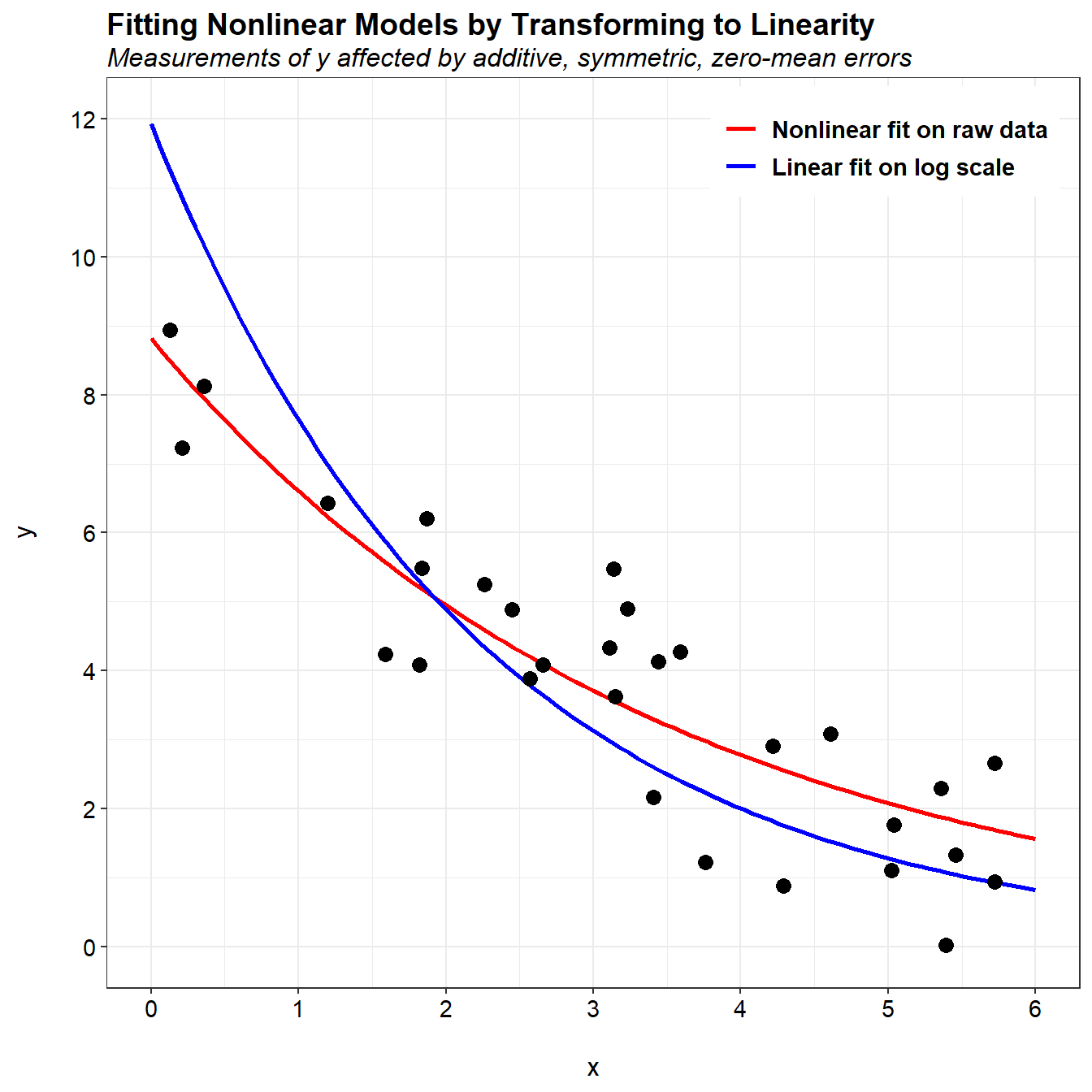
We see that the fit of the nonlinear regression matches the trend in the data much better than linear regression conducted on the log-transformed data. The predictions from the nonlinear regression nominally pass through the center of the data. For linear regression, the predictions are above the data cloud for small values of x and below the data cloud for large values of x.
Let’s inspect the residuals for the nonlinear regression model.
# Construct residual plots for nlfit model using nlstools library
library(nlstools)
nlfit.res <- nlsResiduals(nlfit)
plot(nlfit.res, which = 0)
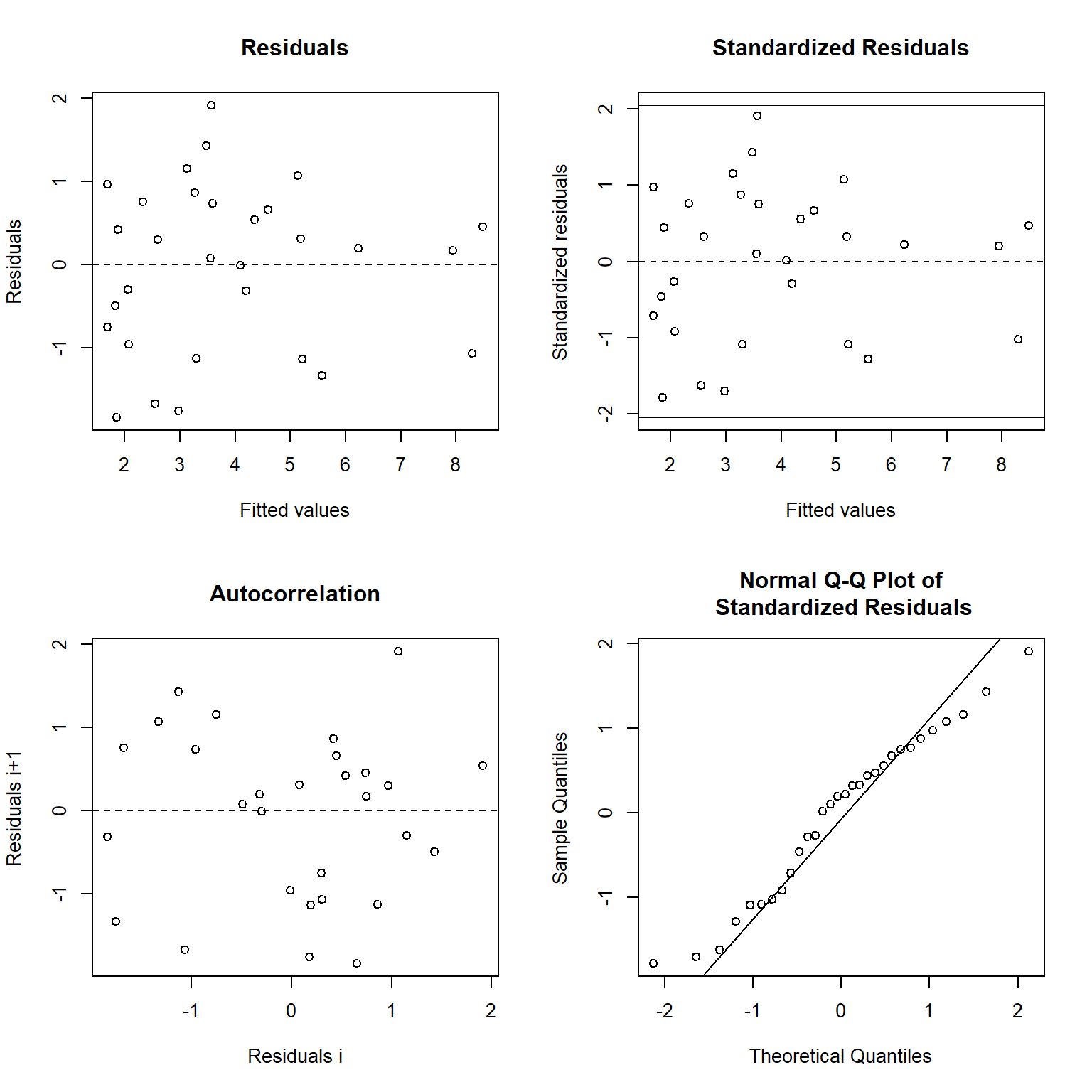
The residuals for the nonlinear regression model indicate the errors have constant variance, with the residuals scattered randomly around zero. This supports the visual observation that the nonlinear model provides a satisfactorily fit to the data.
Let’s plot the data and the two model fits using a natural log scale for the y-axis.
# Create plot using log-scale for y
p <- ggplot(data = pred_long) +
  geom_line(aes(x = newx, y = log(value), color = variable), size = 1) +
  geom_point(data = data.frame(cbind(x, y)), aes(x = x, y = log(y)),
             pch = 16, size = 3) +
  labs(title = 'Fitting Nonlinear Models by Transforming to Linearity',
       subtitle = 'Measurements of y affected by additive, symmetric, zero-mean errors',
       color = NULL,
       x = '\nx',
       y = 'log(y)\n') +
  scale_x_continuous(limits = c(0, 6),
                     breaks = seq(0, 6, by = 1)) +
  scale_y_continuous(limits = c(-4, 3),
                     breaks = seq(-4, 3, by = 1)) +
  scale_color_manual(values = c('y1' = 'red',
                                'y2'  = 'blue'),
                     labels = c('y1' = 'Nonlinear fit on raw data',
                                'y2'  = 'Linear fit on log scale')) +
  theme_bw() +
  theme(plot.title = element_text(margin = margin(b = 3), size = 14,
                       hjust = 0.0, color = 'black', face = quote(bold)),
        plot.subtitle = element_text(margin = margin(b = 3), size = 12,
                          hjust = 0.0, color = 'black', face = quote(italic)),
        axis.title.y = element_text(size = 12, color = 'black'),
        axis.title.x = element_text(size = 12, color = 'black'),
        axis.text.x = element_text(size = 11, color = 'black'),
        axis.text.y = element_text(size = 11, color = 'black'),
        legend.text = element_text(size = 11, face = quote(bold)),
        legend.position = c(0.2, 0.08))
p
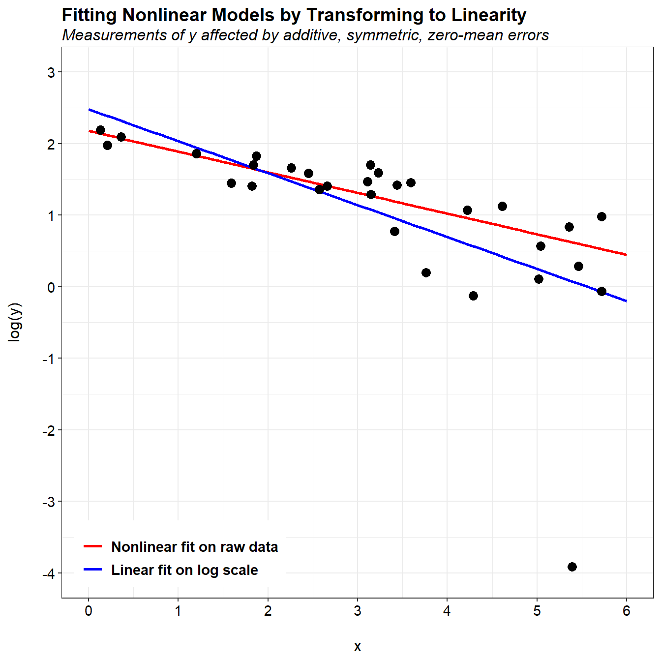
The problem with the linear fit is in the logarithmic transformation. When plotting using a log-scale, we can see an extreme outlier in the data. Although this observation is not considered an outlier in the original data, the nonlinear log transformation has resulted in a change from symmetric measurement errors on the original scale to asymmetric errors on the log scale. Because the linear fit was performed on the log scale, it is impacted by the presence of this outlier.
Let’s change this one point from 0.02 to 1 and then refit the data.
# Change 'outlier' from a value of 0.02 to 1
y[11] <- 1

# Nonlinear regression on raw data
nlfit <- nls(y ~ b0*exp(b1*x), start = list(b0 = max(y), b1 = 1))

# Use nonlinear regression coeff. to get new y values
b0 <- coef(nlfit)[[1]]
b1 <- coef(nlfit)[[2]]
y1 <- b0*exp(b1*newx)

# Linear regression on log-transformed data
linfit <- lm(log(y) ~ x)

# Use linear regression coeff. to get new y values
b0 <- exp(linfit$coeff[1])
b1 <- linfit$coeff[2]
y2 <- b0*exp(b1*newx)

# Create dataframe and use dcast from reshape to change from wide to long format
pred <- data.frame(cbind(newx, y1, y2))
pred_long <- melt(pred, id = 'newx')

# Create plot
p <- ggplot(data = pred_long) +
  geom_line(aes(x = newx, y = value, color = variable), size = 1) +
  geom_point(data = data.frame(cbind(x, y)), aes(x = x, y = y),
             pch = 16, size = 3) +
  labs(title = 'Fitting Nonlinear Models by Transforming to Linearity',
       subtitle = 'Measurements of y affected by additive, symmetric, zero-mean errors',
       color = NULL,
       x = '\nx',
       y = 'y\n') +
  scale_x_continuous(limits = c(0, 6),
                     breaks = seq(0, 6, by = 1)) +
  scale_y_continuous(limits = c(0, 12),
                     breaks = seq(0, 12, by = 2)) +
  scale_color_manual(values = c('y1' = 'red',
                                'y2'  = 'blue'),
                     labels = c('y1' = 'Nonlinear fit on raw data',
                                'y2'  = 'Linear fit on log scale')) +
  theme_bw() +
  theme(plot.title = element_text(margin = margin(b = 3), size = 14,
                       hjust = 0.0, color = 'black', face = quote(bold)),
        plot.subtitle = element_text(margin = margin(b = 3), size = 12,
                          hjust = 0.0, color = 'black', face = quote(italic)),
        axis.title.y = element_text(size = 12, color = 'black'),
        axis.title.x = element_text(size = 12, color = 'black'),
        axis.text.x = element_text(size = 11, color = 'black'),
        axis.text.y = element_text(size = 11, color = 'black'),
        legend.text = element_text(size = 11, face = quote(bold)),
        legend.position = c(0.80, 0.93))
p
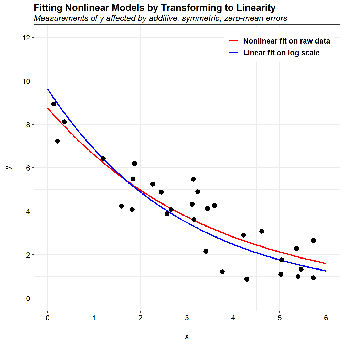
When this single change to the data, the two model fits are now similar. The differences between the two fits are mainly associated with how the measurement errors are distributed. Suppose that instead of additive measurement errors, measurements of y were affected by multiplicative errors. These errors would not be symmetric, and nonlinear regression on the original scale would not be appropriate. Alternatively, the natural log transformation would make the errors symmetric on the log scale, and linear least squares regression on that scale would be appropriate.
Conclusions
In nonlinear regression on untransformed data, it is assumed that the error term is normally distributed and additive on the arithmetic scale. In contrast, the errors for linearization of a nonlinear function when back transformed are lognormally distributed. For an exponential function, this means that the errors act multiplicatively rather than additively. In practice, when the noise term is small relative to the trend, the log transform is “locally linear” in the sense that y values near the same x value will not be “stretched” out too asymmetrically. In that case, the two methods lead to similar fits of the data. When the noise term is not small, you should consider what assumptions are realistic. In cases where the error is approximately multiplicative lognormal, the log-transformed linear regression should be used, while nonlinear regression on untransformed data should be applied to those data sets with additive normal error. For data sets with an indeterminate error structure, a possible solution is to use model averaging to calculate the weighted average of the parameter estimates.
References
Newell, C.J., H.S. Rifai, J.T. Wilson, J.A. Conner. J.A. Aziz, and M.P. Suarez. 2002. Calculation and Use of First-Order Rate Constants for Monitored Natural Attenuation Studies. EPA Ground Water Issue. EPA/540/S-02/500. November.
Newell, C.J., I. Cowie, T.M. McGuire, and W.W. McNab, Jr. 2006. Multiyear Temporal Changes in Chlorinated Solvent Concentrations at 23 Monitored Natural Attenuation Sites. Journal of Environmental Engineering 132, 653-663.
Wilson, J.T. 2011. An Approach for Evaluating the Progress of Natural Attenuation in Groundwater. EPA Ground Water and Ecosystems Restoration Division. EPA 600/R-11/204. December.
- Posted on:
- June 19, 2018
- Length:
- 10 minute read, 1999 words
- See Also: