Outlier Identification Using Mahalanobis Distance
By Charles Holbert
March 27, 2022
Introduction
Outliers are data points that do not match the general character of the data. Often they are extreme values that fall outside the “normal” range of the data. In some cases, outliers can be beneficial to understanding special characteristics of the data. In other cases, outliers might be mistakes in the data that may adversely affect statistical analysis of the data. A popular way to identify and deal with multivariate outliers is to use Mahalanobis distance. In multivariate space, Mahalanobis distance is the distance of each observation from the the center of the data cloud, taking into account the shape (covariance) of the cloud. Larger values indicate that an observation is farther from where most of the points cluster.
Mahalanobis Distance
Euclidean distance is commonly used to find distance between two points. The Euclidean distance between the two points \((p_1, q_1)\) and \((p_2, q_2)\) is given by:
\begin{equation}
 d(p, q) = \sqrt{(p_1 - q_1)^2 + (p_2 - q_2)^2}
 \end{equation}
This equation can be extended to n-dimensional space as follows:
\begin{equation}
 d(p, q) = \sqrt{(p_1 - q_1)^2 + (p_2 - q_2)^2 + .. + (p_n - q_n)^2}
 \end{equation}
The Euclidean distance assumes the data to be isotropically Gaussian. If the dimensions (columns in your dataset) are correlated to one another, which is typically the case in real-world datasets, the Euclidean distance between a point and the center of the points (distribution) may give misleading results. Mahalanobis distance seeks to measure the correlation between variables and relaxes the assumption of the Euclidean distance, assuming instead an anisotropic Gaussian distribution. Because Mahalanobis distance takes into account the correlation in the data by using the precision matrix (inverse of the covariance matrix), it works well when two or more variables are highly correlated, even with dissimilar scales. The probability density function for a multivariate Gaussian distribution uses Mahalanobis distance instead of Euclidean distance.
Mahalanobis distance (Mahalanobis 1936), is a measure of the distance between a point P and a distribution D. It is a multi-dimensional generalization of the idea of measuring how many standard deviations away P is from the mean of D. It weights the distance calculation according to the statistical variation of each component using the covariance matrix of the observed sample. It measures distance relative to the centroid of the data, which can be thought of as an overall mean for multivariate data. The centroid is a point in multivariate space where all means from all variables intersect. The larger the value of Mahalanobis distance, the more unusual the data point (i.e., the more likely it is to be a multivariate outlier).
The formula to compute Mahalanobis distance is given as follows:
\begin{equation}
 D^2 = (x - m)^{T} \cdot C^{-1} \cdot (x - m)
 \end{equation}
where
\(D^2\) = square of the Mahalanobis distance,
x = vector of the observation (row in a dataset),
m = vector of mean values of independent variables (mean of each column), and
C = covariance matrix of independent variables
Outlier Identification Methodology
To identify outliers, the Mahalanobis distance between every point and the center in the n-dimension data are calculated. The calculated Mahalanobis distances are compared against a chi-square \((\chi^2)\) distribution with degrees of freedom equal to the number of variables.
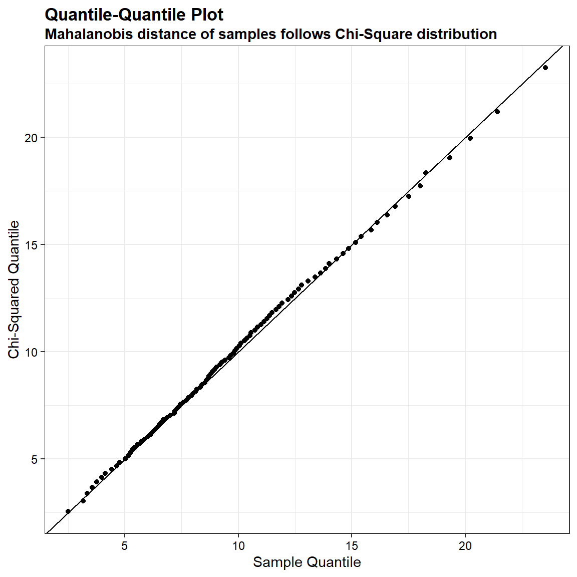
We can demostrate that the quantiles of the Mahalanobis distance of a sample drawn from a Gaussian distribution is very similar to the corresponding quantiles computed on a chi-square distribution. In the quantile-quantile plot shown below, the ordered Mahalanobis distances are plotted versus estimated quantiles for a sample of size 1,000 from a chi-squared distribution with 10 degrees of freedom.
# Load libraries
library(Matrix)
library(MASS)
library(ggplot2)

# Set parameters
DIM = 10
nSample = 1000

# Function
postdef <- function (n, ev = runif(n, 0, 1)) {
  Z <- matrix(ncol = n, rnorm(n^2))
  decomp <- qr(Z)
  Q <- qr.Q(decomp)
  R <- qr.R(decomp)
  d <- diag(R)
  ph <- d / abs(d)
  O <- Q %*% diag(ph)
  Z <- t(O) %*% diag(ev) %*% O
  return(Z)
}

Sigma = postdef(DIM)
muhat = rnorm(DIM)
sample <- mvrnorm(n = nSample, mu = muhat, Sigma = Sigma)

mahaDist <- mahalanobis(x = sample, center = muhat, cov = Sigma)

pps <- (1:100)/(100 + 1)
qq1 <- sapply(X = pps, FUN = function(x) {quantile(mahaDist, probs = x)})
qq2 <-  sapply(X = pps, FUN = qchisq, df = ncol(Sigma))

dat <- data.frame(qEmp = qq1, qChiSq = qq2)

# Create plot
ggplot(data = dat) +
  geom_point(aes(x = qEmp, y = qChiSq)) +
  geom_abline(slope = 1) +
  labs(title = 'Quantile-Quantile Plot',
       subtitle = 'Mahalanobis distance of samples follows Chi-Square distribution',
       x = 'Sample Quantile',
       y = 'Chi-Squared Quantile') +
  theme_bw() +
  theme(plot.title = element_text(margin = margin(b = 3), size = 13,
                           hjust = 0, color = 'black', face = quote(bold)),
        plot.subtitle = element_text(margin = margin(b = 3), size = 11,
                              hjust = 0, color = 'black', face = quote(bold)),
        axis.title.y = element_text(size = 11, color = 'black'),
        axis.title.x = element_text(size = 11, color = 'black'),
        axis.text.x = element_text(size = 9, color = 'black'),
        axis.text.y = element_text(size = 9, color = 'black'))
Outlier Identification Results
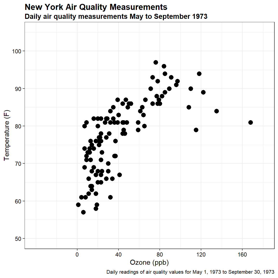
For this example, let’s use the temperature and ozone measurements from the airquality dataset contained within base R. This dataset is composed of daily readings of air quality values collected between May 1, 1973 and September 30, 1973. Mean ozone in parts per billion (ppm) was measured at Roosevelt Island and maximum daily temperature in degrees Fahrenheit (°F) was measured at La Guardia Airport. A summary of the data is provided below.
# Load libraries
library(dplyr)

# Set options so no scientific notation
options(scipen = 999)

# Select only Ozone and Temp variables
dat <- airquality[c('Ozone', 'Temp')]

# Remove missing values from data set
dat <- na.omit(dat)

# Get summary of data
summarytools::descr(dat)
## Descriptive Statistics
## dat
## N: 116
##
##                      Ozone     Temp
## ----------------- -------- --------
##              Mean    42.13    77.87
##           Std.Dev    32.99     9.49
##               Min     1.00    57.00
##                Q1    18.00    71.00
##            Median    31.50    79.00
##                Q3    63.50    85.00
##               Max   168.00    97.00
##               MAD    25.95    10.38
##               IQR    45.25    14.00
##                CV     0.78     0.12
##          Skewness     1.21    -0.24
##       SE.Skewness     0.22     0.22
##          Kurtosis     1.11    -0.72
##           N.Valid   116.00   116.00
##         Pct.Valid   100.00   100.00
Let’s create a scatter plot of the data.
# Create caption
cap <- paste(
  'Daily readings of air quality values for May 1, 1973 to September 30, 1973'
)

# Create scatter plot
ggplot(dat, aes(x = Ozone , y = Temp)) +
  geom_point(size = 3) +
  scale_x_continuous(limits = c(-40, 180),
                     breaks = seq(0, 160, 40)) +
  scale_y_continuous(limits = c(50, 105),
                     breaks = seq(50, 100, 10)) +
  labs(title = 'New York Air Quality Measurements',
       subtitle = 'Daily air quality measurements May to September 1973',
       caption = cap,
       x = 'Ozone (ppb)',
       y = 'Temperature (F)') +
  theme_bw() +
  theme(plot.title = element_text(margin = margin(b = 3), size = 13,
                           hjust = 0, color = 'black', face = quote(bold)),
        plot.subtitle = element_text(margin = margin(b = 3), size = 11,
                              hjust = 0, color = 'black', face = quote(bold)),
        plot.caption = element_text(size = 8, color = 'black'),
        axis.title.y = element_text(size = 11, color = 'black'),
        axis.title.x = element_text(size = 11, color = 'black'),
        axis.text.x = element_text(size = 9, color = 'black'),
        axis.text.y = element_text(size = 9, color = 'black'))
The mahalanobis function, mahalanobis(), that comes in the R stats package returns distances between each point and the given center point. This function takes 3 arguments: x, center, and cov. The variable x is the multivariate data (matrix or data frame), center is the vector of center points of the variables, and cov is the covariance matrix of the data. The function returns D-squared distances.
# Finding the center point
dat.center <- colMeans(dat)

# Finding the covariance matrix
dat.cov <- cov(dat)

# Calculate Mahalanobis distance and add to data
dat$mdist <- mahalanobis(
  x = dat,
  center = dat.center,
  cov = dat.cov
)
For plotting the data, let’s create an ellipse by considering the center point and covariance matrix. We can find the ellipse coordinates using the ellipse() function that comes in the car package. The ellipse() function takes three main arguments; center, shape, and radius. Center represents the mean values of the variables, shape represents the covariance matrix, and radius is the square root of the chi-square value with k-1 degrees of freedom, where k is the number of variables (which is 2 for our data). Let’s use a probability value of 0.95 to identify outliers, if present in the data. The ellipse() returns the (x, y) coordinates of the calculated ellipse
# Cutoff values from chi-square distribution to identify outliers
cutoff <- qchisq(p = 0.95, df = ncol(dat[, 1:2]))

# Ellipse radius given by square root of chi-square value
rad <- sqrt(cutoff)

# Get ellipse coordinates
ellipse <- car::ellipse(
  center = dat.center,
  shape = dat.cov,
  radius = rad,
  segments = 150,
  draw = FALSE
)
ellipse <- as.data.frame(ellipse)
colnames(ellipse) <- colnames(dat[, 1:2])
The p-value for each distance is calculated as the p-value that corresponds to the chi-square statistic of the Mahalanobis distance with k-1 degrees of freedom. Let’s add the p-values to the data frame. Let’s also add a column to the data frame indicating whether a sample is an outlier based on the cutoff value we calculated above.
# Add p-value for each Mahalanobis distance
dat$p <- pchisq(dat$mdist, df = ncol(dat[, 1:2]), lower.tail = FALSE)

# Add outliers based on Mahalanobis distance to data
dat <- dat %>%
  mutate(Outlier = ifelse(mdist > cutoff, 'Yes', 'No'))
Now, let’s create a scatter plot of the data showing the ellipse and outliers based on Mahalanobis distance.
# Create scatterplot with Mahalanobis outliers
ggplot(dat, aes(x = Ozone , y = Temp, color = Outlier)) +
  geom_point(size = 3) +
  geom_point(aes(dat.center[1], dat.center[2]) , size = 5 , color = 'blue') +
  geom_polygon(data = ellipse, fill = 'grey80', color = 'black', alpha = 0.3) +
  scale_x_continuous(limits = c(-40, 180),
                     breaks = seq(0, 160, 40)) +
  scale_y_continuous(limits = c(50, 105),
                     breaks = seq(50, 100, 10)) +
  scale_color_manual(values = c('black', 'orange3')) +
  labs(title = 'New York Air Quality Measurements',
       subtitle = 'Outlier detection using Mahalanobis distances',
       caption = cap,
       x = 'Ozone (ppb)',
       y = 'Temperature (F)') +
  theme_bw() +
  theme(plot.title = element_text(margin = margin(b = 3), size = 13,
                           hjust = 0, color = 'black', face = quote(bold)),
        plot.subtitle = element_text(margin = margin(b = 3), size = 11,
                              hjust = 0, color = 'black', face = quote(bold)),
        plot.caption = element_text(size = 8, color = 'black'),
        axis.title.y = element_text(size = 11, color = 'black'),
        axis.title.x = element_text(size = 11, color = 'black'),
        axis.text.x = element_text(size = 9, color = 'black'),
        axis.text.y = element_text(size = 9, color = 'black'))
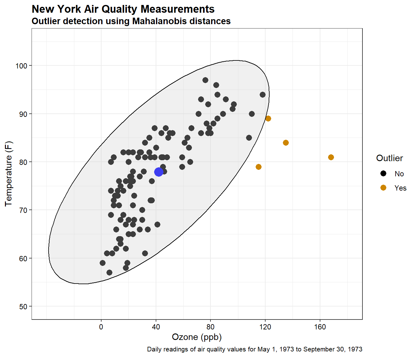
The large blue point on the plot is the center of the data. The black points are the measured observations for ozone and temperature. The four points outside the ellipse are identified as outliers at a significance level of 0.95 based on Mahalanobis distance. These points are listed below.
dat[dat$Outlier == 'Yes',]
##     Ozone Temp     mdist              p Outlier
## 30    115   79  8.835926 0.012058770127     Yes
## 62    135   84 11.326633 0.003470986538     Yes
## 99    122   89  6.385194 0.041065096050     Yes
## 117   168   81 25.200291 0.000003371524     Yes
Probability Distribution Plot
The square of the Mahalanobis distance \((D^2)\) can be transformed into a probability using a chi-squared cumulative probability distribution. By converting Mahalanobis distances into probabilities, we can put the Mahalanobis distances from any number of dimensions on a common 0-1 scale that indicates the probability \(P(\chi^2 \le D^2)\) that a location has a Mahalanobis distance that is greater than would be expected by chance. This is shown below.
# Load libraries
library(fields)
library(RColorBrewer)
library(extrafont)

# Create a grid of values for the underlaying space
dim <- 200
xmin <- -40
xmax <- 160
xseq <- seq(xmin, xmax, ((xmax - xmin) / (dim - 1)))
ymin <- 50
ymax <- 105
yseq <- seq(ymin, ymax, ((ymax - ymin) / (dim - 1)))
xcell <- rep(xseq, dim)
ycell <- rep(yseq, each = dim)
grid <- cbind(xcell,ycell)

# Calcualte Mahalanobis distances for the grid space and points
D2gd <- mahalanobis(grid, dat.center, dat.cov)
D2gd <- matrix(D2gd, nrow = dim) # reform grid xy locations into a matrix
D2xy <- mahalanobis(dat[, 1:2], dat.center, cov = dat.cov)

# Create plot of probabilities
cols <- brewer.pal(8, 'Spectral')[4:8]
chisqCDF <- pchisq(D2gd, df = 2)
breaks <- c(0.0, 0.2, 0.4, 0.6, 0.8, 1.0)

par(oma = c(0, 0, 0, 0), mar = c(0.5, 0.5, 1.5, 5.5))
contour(
  xseq, yseq, chisqCDF,
  xlim = c(-40, 180), ylim = c(50, 105), axes = FALSE,
  levels = breaks, col = cols, lwd = 1.5,
  asp = 1, labcex = 0.75, method = 'flattest',
  main = 'Probabilities for Mahalanobis Distances'
)
contour(
  xseq, yseq, chisqCDF,
  xlim = c(-40, 180), ylim = c(50, 105), axes = FALSE, lty = 'dotted',
  lwd = 1, col = 'black', asp = 1, labcex = 0.75,
  levels = c(0.95), method = 'flattest', add = TRUE
)
image.plot(
  xseq, yseq, chisqCDF, asp = 1,
  xlim = c(-40, 180), ylim = c(50, 105), col = cols,
  breaks = breaks, lab.breaks = sprintf("%.2f", breaks),
  legend.width = 0.8,
  legend.lab = "", legend.shrink = 0.7, legend.cex = 0.6,
  legend.only = TRUE, legend.mar = 8, legend.line = 2
)
mtext(expression(italic(P(chi[2]^2 <= D^2))), side = 4, line = 3)
legend(
  'bottomleft',
  legend = c(expression(italic(alpha == 0.95))),
  lty = 'dotted', bty = 'n'
)
chisqxy <- pchisq(D2xy, df = 2)
points(
  dat[, 1:2],
  pch = 21, bg = cols[floor(chisqxy*5) + 1],
  col = 'black', cex = 1
)
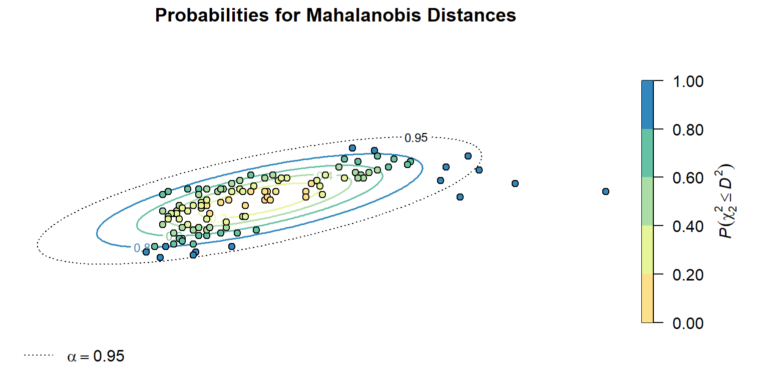
The calculated probability values follow a characteristic elliptical pattern, radiating out from the central location of the distribution. The transformed \(D^2\) values to \(P(\chi^2 \le D^2)\) indicate four points that are likely to be outliers at an \(\alpha\) = 0.95.
Conclusions
The Mahalanobis distance is a statistical technique that can be used to measure how distant a point is from the center of a multivariate normal distribution. Mahalanobis distances can be converted into probabilities using a chi-squared distribution. By specifying a significance level \(\alpha\), this process is commonly used as an outlier detection method as it is: parameter free, computational efficient, accounts for collinearity between variable dimensions, and is scale independent (Aggarwal 2017).
References
Aggarwal C.C. 2017. Outlier Analysis, 2nd Edition. Cham, Springer.
Mahalanobis, P.C. 1936. On the generalised distance in statistics. Proceedings of the National Institute of Sciences of India. 2, 49-55.
- Posted on:
- March 27, 2022
- Length:
- 12 minute read, 2377 words
- See Also: