Exploring Global Surface Temperature Change
By Charles Holbert
April 19, 2021
Introduction
Climate change is a alteration in the statistical properties of the climate system, which include temperature, humidity, wind and rainfall. Changes in climate occur as a result of both natural and human-induced causes. Natural forces that contribute to climate change include variations in the sun’s intensity, volcanic eruptions, and changes in naturally occurring greenhouse gas concentrations. Man-made climate changes involve increasing atmospheric concentrations of greenhouse gases, which include carbon dioxide \((CO_2)\), methane \((CH_4)\), nitrous oxide \((N_2O)\), and several other gases. The burning of fossil fuels is the primary source of human-generated emissions. A second major source is deforestation, which releases sequestered carbon into the air. Long-term warming of the planet has been occurring since the early 20th century, most notably since the late 1970s, because natural carbon sinks can’t keep up with rising greenhouse gas emissions.
In celebration of Earth Day, in this factsheet we will conduct an evaluation of surface temperature change using temperature measurements that have been consistently collected at Kremsmünster Abbey in Austria since the late eighteenth century. These data are considered to be one of the highest quality, longest running, instrumental temperature records in the world.
Data
The oldest, still active weather station in the world is located in Upper Austria within the Kremsmünster Abbey, a Benedictine monastery. The monastery was founded in 777 AD by Tassilo III, the Duke of Bavaria. An observatory was built on the premises between 1749 and 1758. The weather station was added in 1762, and started its observations in the following year. Since 1767, it has been keeping temperature recordings in one unprecedented series without interruption. The reliable records are reported to have began in 1796, but the Weather Service of Austria, Zentralanstalt für Meteorologie und Geodynamik (ZAMG) harmonized the older data in the meteorological diary, so that December 28, 1762 is given as the start of the record ( https://de.zxc.wiki/wiki/Sternwarte_Kremsmünster).
Daily temperatures recorded at Kremsmünster going back to 1876 can be downloaded from European Climate Assessment & Dataset project (ECA&D). The objective of ECA&D is to monitor and analyze climate and changes in climate with a focus on climate extremes while making the data publicly available to download. The ECA&D collects data from thousands of stations spanning the European and Mediterranean domain.
The data are formatted as a tidy temporal data frame designed to easily manipulate and analyze temporal data, such as filling in time gaps and aggregating over calendar periods. There are 5 fields and 53,020 records. Fields include measurement month and date, minimum and maximum daily temperature, and mean daily temperature.
# Load libraries
library(tsibble)
library(tidyverse)
library(lubridate)
library(magrittr)
library(patchwork)

# Daily Minimum Temperature
raw <- read_csv('data/ECAD/TN_STAID000011.txt', skip = 20)
raw %<>% select(-STAID, -SOUID) %>% rename(date = DATE, min_temp = TN, qual = Q_TN)
raw %<>% mutate(min_temp = replace(min_temp, min_temp <= -9999, NA)) %>%
         mutate(min_temp = replace(min_temp, qual == 1 | qual == 9, NA))
raw %<>% mutate(min_temp = min_temp*0.1, date = ymd(date)) %>% select(-qual)
min_temp <- raw %>% as_tsibble(index = date)

# Daily Maximum Temperature
raw <- read_csv('data/ECAD/TX_STAID000011.txt', skip=20)
raw %<>% select(-STAID, -SOUID) %>% rename(date = DATE, max_temp = TX, qual = Q_TX)
raw %<>% mutate(max_temp = replace(max_temp, max_temp <= -9999, NA)) %>%
         mutate(max_temp = replace(max_temp, qual == 1 | qual == 9, NA))
raw %<>% mutate(max_temp = max_temp*0.1, date = ymd(date)) %>% select(-qual)
max_temp <- raw %>% as_tsibble(index = date)

# Daily Mean Temperature
krem <- left_join(min_temp, max_temp)
rm(max_temp, min_temp, raw)
krem %<>% mutate(mean_temp = (max_temp + min_temp)/2,
                 month = month(date))

# Data structure
str(krem)
## tbl_ts [53,020 x 5] (S3: tbl_ts/tbl_df/tbl/data.frame)
##  $ date     : Date[1:53020], format: "1876-01-01" "1876-01-02" ...
##  $ min_temp : num [1:53020] -5 -3 0.4 -10.6 -11.8 -14.3 -17.8 -11.4 -15.8 -11 ...
##  $ max_temp : num [1:53020] 0.6 1.5 2 0.8 -9 -8 -10 -6.5 -7.5 -3.8 ...
##  $ mean_temp: num [1:53020] -2.2 -0.75 1.2 -4.9 -10.4 ...
##  $ month    : num [1:53020] 1 1 1 1 1 1 1 1 1 1 ...
##  - attr(*, "key")= tibble [1 x 1] (S3: tbl_df/tbl/data.frame)
##   ..$ .rows: list<int> [1:1]
##   .. ..$ : int [1:53020] 1 2 3 4 5 6 7 8 9 10 ...
##   .. ..@ ptype: int(0)
##  - attr(*, "index")= chr "date"
##   ..- attr(*, "ordered")= logi TRUE
##  - attr(*, "index2")= chr "date"
##  - attr(*, "interval")= interval [1:1] 1D
##   ..@ .regular: logi TRUE
A summary of the data is provided below. Records begin in January 1, 1876 and run through February 28, 2021 with few missing values. These data represent 145 years of surface temperature measurements recorded at the Kremsmünster weather station.
# Data summary
summary(krem)
##       date               min_temp          max_temp        mean_temp
##  Min.   :1876-01-01   Min.   :-25.600   Min.   :-18.60   Min.   :-21.400
##  1st Qu.:1912-04-16   1st Qu.: -0.100   1st Qu.:  4.80   1st Qu.:  2.400
##  Median :1948-07-31   Median :  5.400   Median : 13.00   Median :  9.200
##  Mean   :1948-07-31   Mean   :  5.167   Mean   : 12.48   Mean   :  8.826
##  3rd Qu.:1984-11-14   3rd Qu.: 11.300   3rd Qu.: 20.10   3rd Qu.: 15.700
##  Max.   :2021-02-28   Max.   : 22.100   Max.   : 36.50   Max.   : 28.250
##                       NA's   :28        NA's   :32       NA's   :33
##      month
##  Min.   : 1.000
##  1st Qu.: 4.000
##  Median : 7.000
##  Mean   : 6.517
##  3rd Qu.:10.000
##  Max.   :12.000
##
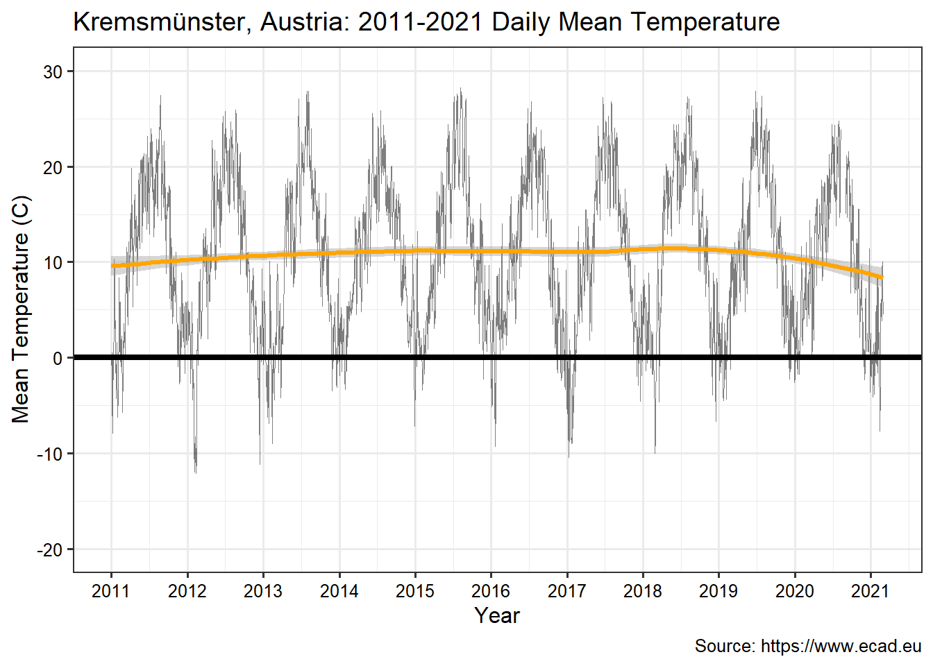
A snapshot of the daily mean temperature over the last 10 years of data, from 2011 through February of 2021, is shown below. A local polynomial regression line is shown in orange on the figure. During this period, the temperature ranges from approximately -10 °C to 28 °C with a mean of 10 °C.
# Create plot of daily mean temperature
theme_set(theme_bw(base_size = 12))
ggplot(data = krem, aes(x = date, y = mean_temp)) +
  geom_line(size = 0.3, alpha = 0.5)  +
  geom_smooth(method = 'loess', span = 0.75, size = 1.2, color = 'orange') +
  geom_hline(yintercept = 0, color = 'black', linetype = 1, size = 1.5) +
  scale_x_date(limits = c(as.Date('2011-01-01'), as.Date('2021-03-01')),
               date_breaks = '1 years',
               date_labels = '%Y') +
  scale_y_continuous(limits = c(-20, 30),
                     breaks = seq(-20, 30, 10))  +
  labs(title = 'Kremsmünster, Austria: 2011-2021 Daily Mean Temperature',
       caption = 'Source: https://www.ecad.eu',
       x = 'Year',
       y = 'Mean Temperature (C)') +
  theme(axis.text.x = element_text(color = 'black'),
        axis.text.y = element_text(color = 'black'))
Data Analysis
Monthly Temperature Change
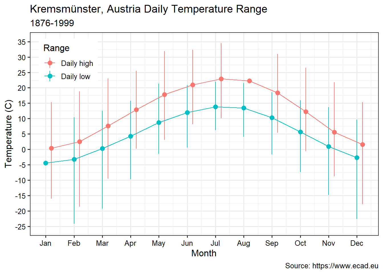
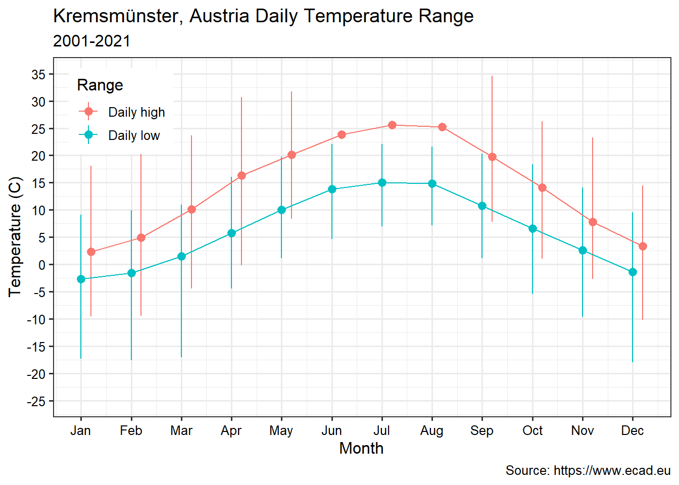
Graphs showing the temperature range of daily highs and lows by month for two different time periods is shown below. The first graph represents data prior to the year 2000 while the second graph represents data from 2000 onward. Over the last 20 years, winter lows are close to -17 °C. This is compared to the first 124 years where the winter lows ranged from -25 °C to -20 °C. Furthermore, temperatures during the summer months have shifted higher and 30 °C to 35 °C degree temperatures are more common. Overall winters in recent years have become less cold, and the summers warmer.
# Monthly temperatures
krem_narrow <- gather(
  krem, key = 'type', value = 'Temp',
  min_temp, max_temp, mean_temp
) %>% as_tibble()

krem_range <- krem_narrow %>%
  group_by(type, month) %>%
  summarize(
    mean = mean(Temp, na.rm = T),
    max = max(Temp, na.rm = T),
    min = min(Temp, na.rm = T)
  )
months <- c('Jan', 'Feb', 'Mar', 'Apr', 'May', 'Jun',
            'Jul', 'Aug', 'Sep', 'Oct', 'Nov', 'Dec')

# Monthly Temperature 1876 - 2000 and 2000 - 2020
krem_narrow <- gather(
  krem, key = 'type', value = 'Temp',
  min_temp, max_temp, mean_temp
) %>% as_tibble()

krem_range_1 <- krem_narrow %>%
  filter(date < as.Date('2000-01-01')) %>%
  group_by(type, month) %>%
  summarize(
    mean = mean(Temp, na.rm = T),
    max = max(Temp, na.rm = T),
    min = min(Temp, na.rm = T)
  )

krem_range_2 <- krem_narrow %>%
  filter(date >= as.Date('2000-01-01')) %>%
  group_by(type, month) %>%
  summarize(
    mean = mean(Temp, na.rm = T),
    max = max(Temp, na.rm = T),
    min = min(Temp, na.rm = T)
  )

# Create first plot
ggplot(data = krem_range_1, aes(x = month, y = mean, color = type)) +
  geom_pointrange(data = subset(krem_range_1, type == 'min_temp'),
                  aes(ymin = min, ymax = max)) +
  geom_pointrange(data = subset(krem_range_1, type == 'max_temp'),
                  aes(ymin = min, ymax = max), position = position_nudge(0.2)) +
  geom_line(data = subset(krem_range_1, type == 'min_temp')) +
  geom_line(data = subset(krem_range_1, type == 'max_temp'),
            position = position_nudge(0.2)) +
  scale_x_continuous(breaks = 1:12,
                     labels = months) +
  scale_y_continuous(limits = c(-25, 35),
                     breaks = seq(-25, 35, 5)) +
  scale_color_discrete(breaks = c('max_temp', 'min_temp'),
                       labels = c('Daily high', 'Daily low')) +
  labs(title = 'Kremsmünster, Austria Daily Temperature Range',
       subtitle = '1876-1999',
       caption = 'Source: https://www.ecad.eu',
       x = 'Month',
       y = 'Temperature (C)') +
  guides(color = guide_legend(title = 'Range')) +
  theme(axis.text.x = element_text(color = 'black'),
        axis.text.y = element_text(color = 'black'),
        legend.position = c(0.11, 0.85))

# Create second plot
ggplot(data = krem_range_2, aes(x = month, y = mean, color = type)) +
  geom_pointrange(data = subset(krem_range_2, type == 'min_temp'),
                  aes(ymin = min, ymax = max)) +
  geom_pointrange(data = subset(krem_range_2, type == 'max_temp'),
                  aes(ymin = min, ymax = max), position = position_nudge(0.2)) +
  geom_line(data = subset(krem_range_2, type == 'min_temp')) +
  geom_line(data = subset(krem_range_2, type == 'max_temp'),
            position = position_nudge(0.2)) +
  scale_x_continuous(breaks = 1:12,
                     labels = months) +
  scale_y_continuous(limits = c(-25, 35),
                     breaks = seq(-25, 35, 5)) +
  scale_color_discrete(breaks = c('max_temp', 'min_temp'),
                       labels = c('Daily high', 'Daily low')) +
  labs(title = 'Kremsmünster, Austria Daily Temperature Range',
       subtitle = '2001-2021',
       caption = 'Source: https://www.ecad.eu',
       x = 'Month',
       y = 'Temperature (C)') +
  guides(color = guide_legend(title = 'Range')) +
  theme(axis.text.x = element_text(color = 'black'),
        axis.text.y = element_text(color = 'black'),
        legend.position = c(0.11, 0.85))
Temperature Anomaly
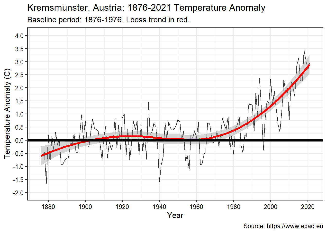
The most common way to quantify change is to present temperature anomaly. This represents the difference between the long-term average temperature (referred to as a reference value) and the temperature that is observed. In other words, the long-term average temperature is one that would be expected; the anomaly is the difference between what you would expect and what is happening. A positive anomaly indicates that the observed temperature was warmer than the reference value, while a negative anomaly indicates that the observed temperature was cooler than the reference value.
The reference period (or the “baseline”), usually is at least 30 years long, to define what the “expected” or “average” temperature is for each day of the year. This defines the climatology which captures both the overall average and the seasonal cycle, the warming and cooling that comes with the passing of the year. For this analysis, we will plot the annual average anomaly versus a 100-year (1876-1976) baseline. The results are shown in the graph below, which also includes a local polynomial regression line (shown in red) indicating the trend in temperature difference over time. Since about 1970, temperature has been increasing. Since the temporal monitoring record began in 1876, there has been a net increase of almost 3 °C in the surface temperature at Kremsmünster.
# Plot the annual average anomaly vs a 100-year baseline (1876-1976).
krem_narrow %<>% mutate(day = yday(date))
krem_range <- krem_narrow %>%
  filter(type == 'mean_temp', date < as.Date('1976-01-01')) %>%
  group_by(day) %>%
  summarize(centurymean = mean(Temp, na.rm = T))

anomaly <- krem_narrow %>%
  filter(type == 'mean_temp') %>%
  left_join(krem_range) %>%
  mutate(anomaly = Temp - centurymean) %>%
  select(date, anomaly)

anomaly %<>% mutate(year = year(date)) %>%
  as_tsibble(index = date) %>%
  index_by(year) %>%
  summarize(anom = mean(anomaly, na.rm = T))

ggplot(data = anomaly, aes(x = year, y = anom)) +
  geom_line(alpha = 0.8) +
  geom_smooth(size = 1.5, color = 'red') +
  geom_hline(yintercept = 0,color = 'black', linetype = 1, size = 2) +
  scale_x_continuous(breaks = seq(1880, 2020, 20)) +
  scale_y_continuous(limits = c(-2, 4),
                     breaks = seq(-2, 4, 0.5))  +
  labs(title = 'Kremsmünster, Austria: 1876-2021 Temperature Anomaly',
       subtitle = 'Baseline period: 1876-1976. Loess trend in red.',
       caption = 'Source: https://www.ecad.eu',
       x = 'Year',
       y = 'Temperature Anomaly (C)') +
  theme(axis.text.x = element_text(color = 'black'),
        axis.text.y = element_text(color = 'black'))
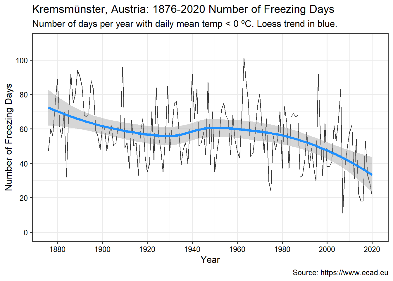
Subzero Temperature Days
Although a 3 °C temperature seems modest, it’s not. The biggest statistical effect and the greatest potential damage are due to how temperature change affects the extremes; cold days become more rare and hot days more common. The graph below shows the number of days each year (from July through the following June) when the daily mean temperature was 0 °C or below. While Kremsmünster used to experience 60 to 70 days per year of subzero temperature, that number is now down to about 43 days.
krem_narrow %<>%
  mutate(year = year(date), winter = ifelse(month > 6, 1, 0)) %>%
  mutate(year = year + winter) %>%
  select(-winter)

krem_high <- krem_narrow %>%
  filter(type == 'max_temp') %>%
  select(date, Temp, year)

krem_narrow %<>% filter(type == 'mean_temp') %>%
  select(date, Temp, year)

num_freeze_days <- krem_narrow %>%
  group_by(year) %>%
  filter(Temp <= 0) %>%
  summarize(num_freezing = n())

num_freeze_days %<>% filter(year <= 2020) %>%
  as_tsibble(index = year)

ggplot(data = num_freeze_days, aes(x = year, y = num_freezing)) +
  geom_line(alpha = 0.8) +
  geom_smooth(size = 1.5, color = 'dodgerblue') +
  scale_x_continuous(breaks = seq(1880, 2020, 20)) +
  scale_y_continuous(limits = c(0, 110),
                     breaks = seq(0, 110, 20))  +
  labs(title = 'Kremsmünster, Austria: 1876-2020 Number of Freezing Days',
       subtitle = 'Number of days per year with daily mean temp < 0 ºC. Loess trend in blue.',
       caption = 'Source: https://www.ecad.eu',
       x = 'Year',
       y = 'Number of Freezing Days') +
  theme(axis.text.x = element_text(color = 'black'),
        axis.text.y = element_text(color = 'black'))
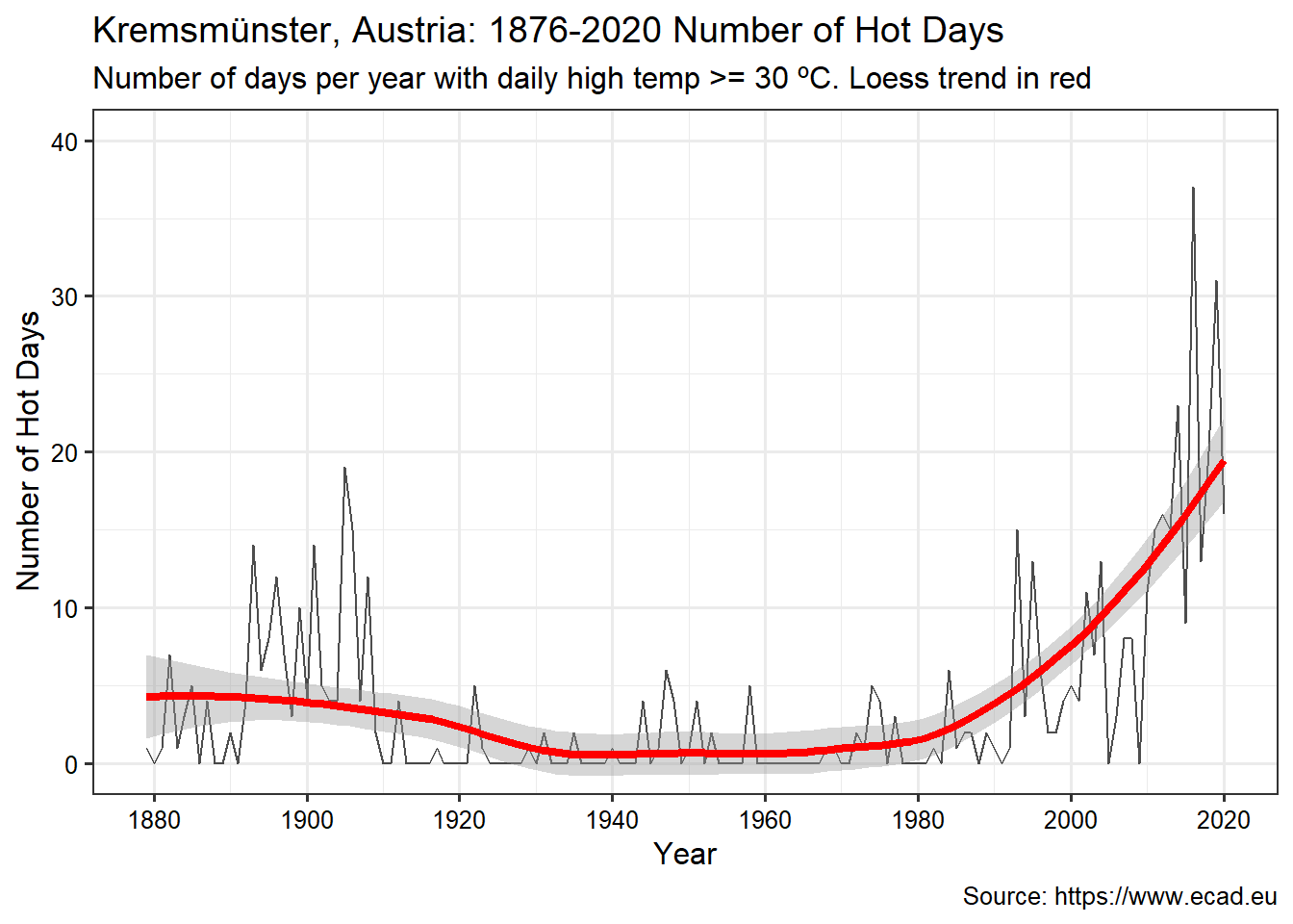
Hot and Excessive Heat Days
As mentioned above, hot days have become more common due to the temperature change at Kremsmünster. The graph below shows the number of hot (> 30 °C) temperature days per year. The number of hot days has increased from <5 days per year to now almost 20 days per year.
\vspace{8pt}
num_hot_days <- krem_high %>%
  filter(year <= 2020) %>%
  group_by(year) %>%
  filter(Temp >= 30) %>%
  summarize(num_hot = n()) %>%
  as_tsibble(index = year) %>%
  fill_gaps() %>%
  replace_na(list(num_hot = 0))

ggplot(data = num_hot_days, aes(x = year, y = num_hot)) +
  geom_line(alpha = 0.7) +
  geom_smooth(size = 1.5, color = 'red') +
  scale_x_continuous(breaks = seq(1880, 2020, 20)) +
  scale_y_continuous(limits = c(0, 40),
                     breaks = seq(0, 40, 10),
                     oob = scales::rescale_none)  +
  labs(title = 'Kremsmünster, Austria: 1876-2020 Number of Hot Days',
       subtitle = 'Number of days per year with daily high temp >= 30 ºC. Loess trend in red',
       caption = 'Source: https://www.ecad.eu',
       x = 'Year',
       y = 'Number of Hot Days') +
  theme(axis.text.x = element_text(color = 'black'),
        axis.text.y = element_text(color = 'black'))
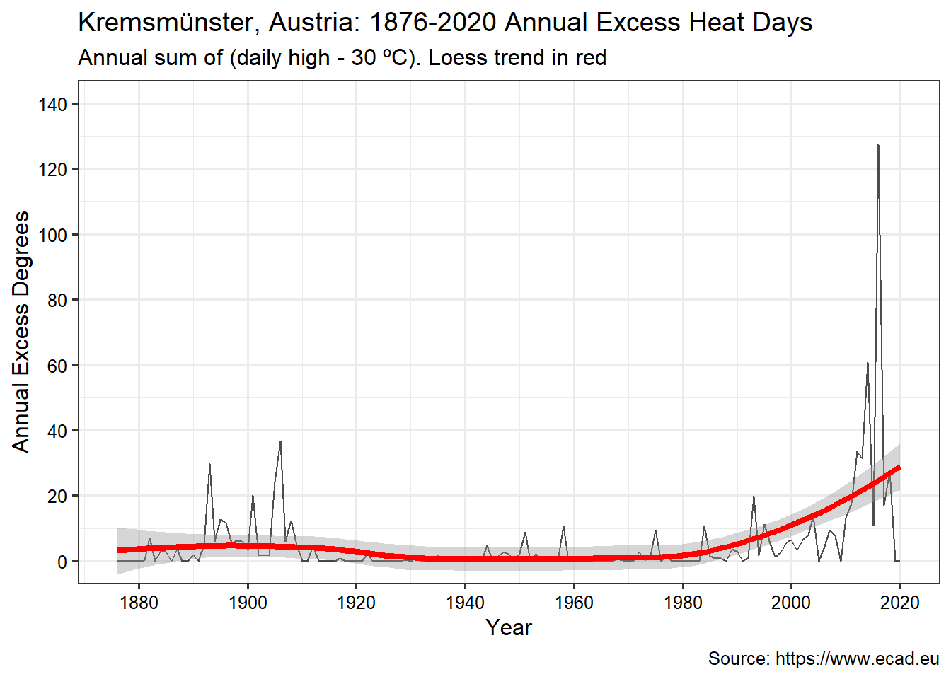
The graph below shows the cumulative sum of daily temperatures in excess of 30 °C over the course of a year at Kremsmünster. This provides insight not only on the number of hot days a year, but also the cumulative excess heat. While the number of excessive heat days was essentially zero through 1980, it has increased significantly during the last 10 years.
excess_degrees <- krem_high %>%
  mutate(excess_heat = ifelse(Temp - 30 > 0, Temp - 30, 0)) %>%
  group_by(year) %>%
  summarize(excess_degrees_total = sum(excess_heat)) %>%
  as_tsibble(index = year) %>%
  fill_gaps() %>%
  replace_na(list(excess_degrees_total = 0)) %>%
  filter(year <= 2020)

ggplot(data = excess_degrees, aes(x = year, y = excess_degrees_total)) +
  geom_line(alpha=0.7) +
  geom_smooth(size = 1.5, color = 'red') +
  scale_x_continuous(breaks = seq(1880, 2020, 20)) +
  scale_y_continuous(limits = c(0, 140),
                     breaks = seq(0, 140, 20),
                     oob = scales::rescale_none) +
  labs(title = "Kremsmünster, Austria: 1876-2020 Annual Excess Heat Days",
       subtitle = 'Annual sum of (daily high - 30 ºC). Loess trend in red',
       caption = 'Source: https://www.ecad.eu',
       x = 'Year',
       y = 'Annual Excess Degrees') +
  theme(axis.text.x = element_text(color = 'black'),
        axis.text.y = element_text(color = 'black'))
Conclusion
While this analysis pertains to only a single location, there is general scientific consensus that Earth’s climate is warming in response to increasing concentrations of greenhouse gases in the atmosphere, largely as the result of human activities. If no mitigating actions are taken, significant disruptions in the Earth’s physical and ecological systems are likely to occur. Addressing the challenges posed by climate change will require a combination of adaptation and reduction in greenhouse gas emissions.
- Posted on:
- April 19, 2021
- Length:
- 13 minute read, 2604 words
- See Also: